Logo design is something of an art form. It’s an endless task of trying to get a simple shape to do multiple jobs.
The core aim of a logo is to be:
- Unique
- Simple
- Communicative
- Memorable
- Eye-catching
The most recognisable logos tend to be very, very simple. Take Nike, McDonalds or Apple. No complicated illustrations or Photoshop filters in sight. Well, sometimes they use them, but what I am saying is at the core of the logo there are no gradients or filters. Simply using a flat shape is just as successful as it is when it’s made to look super glitzy.
Creating great logos is never easy, but given a set of guides, you could create great logos or even adapt an existing logo to be superior.
I will apply the steps to a fictional company – Bellisimo Diner (A Premium local Italian Restaurant, where you can order pizza online). Not all rules will apply to all logos, but this should give you an insight into the choices made in a typical logo design project.

1. Closely examine what you have to play with
First things first. Check out the logos of your competition and aim to improve on them. This gives you a goal. Aim to create something more appealing and unique than your peers.
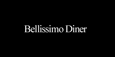
Then, type out the logo in a standard everyday font, like Georgia and Helvetica, and examine the words in both uppercase and lowercase. This will show you what you have to play with. Look at the space between letters and how the letters interact. Forget what they say for now, this is all about shapes and letterforms. Is the letter-spacing even on all letters? What special shapes do I have to work with e.g. “G” with a closed hoop, or “G” with an open hoop.
You might identify glyphs, and unique forms made up from letters (See the Fed Ex Logo hidden Arrow). I find company names that are very long or contain numbers the hardest to work with (123-reg 🙂 ).
Another good thing to aim for is a strong silhouette. As with good icon design, your logo needs to boast a strong, unique outline for the eye to scan and remember. Coca-Cola is a good example of this. If the outline is not clear, the concept will fail.
2. Size and Proximity
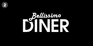
The next step is to balance the text and investigate different layouts of text. If possible, you’ll want to distinguish the business core differentiator. In this case the company is a Diner “Bellissimo” is just filler; it’s redundant to the viewer so this becomes secondary in size, or weight. Initially I set the logo out in all uppercase, as this gave me good solid edges to work with.
When playing with the size of elements, try to apply simple maths rules to the layout. For example, if line 1 of your logo is to be smaller in height than line 2, as with our “Bellissimo Diner” logo. Try to make line 1 half, or a third of the height of the line 2. This will give it some order and vertical rhythm.
3. Typography and additional elements
This is where you identify which fonts are suitable for your identity. And this is also where there are so many pitfalls to avoid. I see far too many logo’s with strong concepts that with an unsuitable font choice have been ruined. In my opinion fonts are the nuts and bolts of any design, choose the right one, and the design is in a good place to succeed, the wrong one and it will fall over.
Font selection is like a tone of voice. Do you want your company to sound like a corporate newsreader (Think Michael Burke – Garamond), or a surfer (Rockwell), or the 80’s Movie Trailer Guy (Trajan).
There are millions of freely available fonts all over the internet. Dafont is a good starting point for free fonts, but and this is a big but, the best, premium fonts you have to pay for. Check out fontfont.com or myfonts.com. Choose wisely and these fonts will make your brand sing.
For our fictional firm, i’ve gone with the bold sans serif “Avant Garde” for the DINER which is fairly stylish and understated, and Harlow, an Italian looking script for the “Bellisimo”.
At this point you should have a decent concept to take further. From there you can go on and introduce colour and texture. But remember, if the logo doesn’t work in black and white, it certainly won’t in any other colour. One final rule is to try and produce a logo that works on a dark background and a light background. If it works on both, your on to a winner.
Have a play with the several concepts, derived from the steps above. Then choose one that feels right and develop further. A good rule of thumb is to leave a concept for a day or two and return to see if it still feels as good. Another good tip is to look at it in a mirror, and see if it still looks balanced.
If it feels right go grab a beer and put your feet up. Your new logo is well on it’s way.
Good luck with your logo project, I hope this helps…
The author of this post, Ian Ryde is a Designer who has worked at 123-reg since 2006. He designed the current logos for 123-reg and our sister brand Webfusion. He is obsessed about typography, and nuts about all things made from pixels.


