How your small business can use psychology to engage customers
You may have noticed we’ve got a new website! It launched back in August, thanks to the hard work of our copywriters, designers and developers.
We’ve also moved to a new platform too: WordPress. Our customers love WordPress for their own sites. And we do too, so decided to put our money where out mouth is.
Why did we do it? From a design point of view I think its fair to say the style of the old logo and website was looking tired.
Our ‘Early Learning Centre’ style 1 2 3 blocks had been around for a decade. And the website was based on an outdated style, with outmoded fonts and was old-school narrow (only 720pixels).
And from a development point of view, the 123 Reg website was entirely hand coded. A custom job. It worked well, but required experts to update.
By contrast, as anyone using WordPress will be able to tell you, managing and updating a site is a doddle. One person can now make changes in minutes that used to take the design and developer team hours.
So does the new site work? When we asked our customers, you told us you needed our website to easy to use and super fast. There’s still a long way to go but so far the feedback is good.
Applying what you know
Our new website design was an opportunity to practice the kind of stuff we preach to you about. Any regular reader of our blog will have gorged on posts about copywriting, landing page design, site structure and messaging.
So I thought I’d take the opportunity to share some of the design and copy features we’ve used, and their psychological roots.
Because when it comes to web design, everything can be linked to Psychological Bias. These are tendencies that we all have to think and act in certain ways.
When it comes to web design, you can take advantage of these inherent preferences to craft a website that guides visitors towards the action you want them to take.
So what types of Psychological and Cognitive biases have informed our new design?
Belief bias
What does it mean? This is where people believe in something based on how believable the outcome is. Put another way: if people think that the effect you will have on their life is believable, then they are more like to trust what you are saying.
If you make extraordinary assertions, they will literally be ‘too good to be true’.
How have we used this? We’ve stopped talking about the features of our products, and started focusing on the difference it will make to you, our customer. And we’ve made our claims believable.
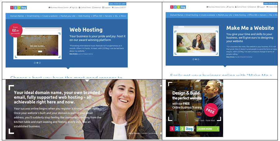
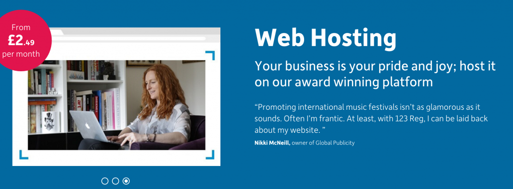
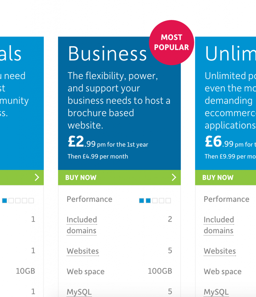
Let’s take Web Hosting for example. Even up to fairly recent times we used to wax lyrical about how much web space we gave away (unlimited), the number of mailboxes, the number of databases.
But now we focus on how fast your website will be, and that we’re around 24/7 in case you need help. These are the effects that the product will have on your life. It’s, the stuff you really care about.
‘Unlimited’ for £2.99/m isn’t an outcome. And it just isn’t believable. So we don’t say it any more.
How can you apply it?
Stop talking about the features of your products, and instead tell people how your product will solve their problem. How you will benefit them and make their lives better. Make the effect believable.
Because it’s an outcome they desire, they will trust the features of your product.
Attention bias
What does it mean? In simple terms, this suggests we trust brands more the more frequently we interact with them. Frequency fosters familiarity and trust, which leads to purchases.
How have we used it?
This comes down to consistency. Prior to the change, each product page looked a bit different, with variations in tone and style. Each campaign we ran was updated to the latest branding, but that meant it wasn’t consistent with what had gone before.
Now, thanks to WordPress and a strict adherence to our brand guidelines, we have huge consistency across our website. Headers all look the same. Product tables look the same. We use language in the same way for every product.
Even away from the website, our marketing materials follow strict guidelines. Benefits are always presented in the same way. Customer stories look similar. The call to action is consistent.
Consistency doesn’t just refer to how we present our brand. It also refers to the consistent frequency we try to interact with you, our customers.
We try to keep you informed with relevant emails. We’re offering helpful advice on social media. And we try to make sure we have a presence in the other events and websites you visit when considering your web presence.
And every time we appear in your lives, that consistent look and feel means we’re instantly recognisable and familiar.
How can you apply it?
Create a ‘brand guidelines’ document the sets out style, design and tone of your marketing. Lock down your logo, decide on your colours and images, stick to a design and copy template. Follow these rules.
Make sure your customers recognize your business simply through the consistency of your materials. They’ll feel at home with your brand, and happier to purchase.
Empathy gap
What does it mean? It suggests that the emotional rather than the rational plays a significant role in decision-making. Website visitor might be less persuaded by clear logical benefits, and more likely to respond to an emotional call to action
How have we used it?
We’ve taken advantage of this bias on our product pages by showcasing other customers and what they’ve said about us
For product table we show which are most popular.
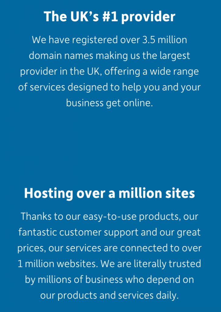
On our ‘About us’ page we talk about the number of other customers we look after and their websites.
How can you apply it?
Starting a business can feel like a mountain to climb. You need to gird your loins, gather your forces and take the plunge.
We try to harness this intake of breath with emotional headlines and a call to action. We try to make you believe in yourself.
It’s not about appealing to the logical benefits of building a website, the benefits of getting your business online, or how easy it can be. It’s a rallying call-to-arms!
How can you apply it?
Consider your customer’s frame of mind. Why do they need your products? Are they looking for peace of mind, or a bit of excitement? Do they want reassurance or a challenge?
Create copy and use images that build on their emotional desire to solve the problem, rather than simply setting out the cold benefits of your products.
Contrast effect
What does it mean? The theory is that contrast or surprise causes the brain to slow down and focus on the difference, and commit it to memory.
In simple terms, if you see the same stuff all the time you start ignoring it. If something out of the ordinary pops up, and it touches you, it grabs your attention.
How have we used it?
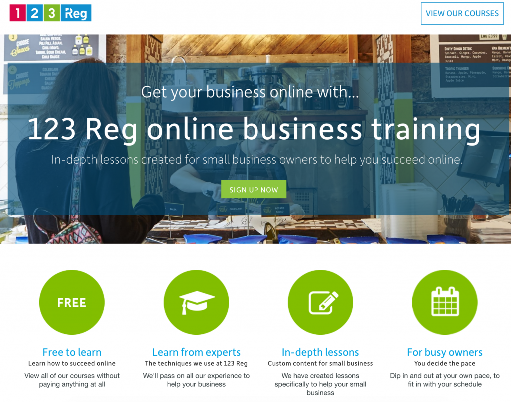
In many ways, but one of the nicest illustration is our Online Business Training. It’s 60 courses to help anyone get and grow their business online. Equivalent courses from others cost thousands. This is entirely free, to anyone.
Because it’s unexpected, Online Business Training causes visitors to stop and take note. They remember it. And that makes 123 Reg mean something more than just a service provider.
How can you apply it?
Give you customers a hook to remember you.
On your website, use a surprising or jaw dropping image to illustrate a point you’re trying to make.
If you have a shop, then treat customers with a free gift.
If you mostly interact with customers over the phone, then send them a treat.
Surprise your customers and they’ll remember you.
Bandwagon effect
What does it mean? This is the tendency of people to behave in a way they believe similar to others. It’s sometimes known as the ‘herd’ mentality.
How have we used it?
When it comes to website design, this is tactic often called ‘social proofing’. The idea is that if you can show people that others facing the same dilemma decided to behave in a particular way, they will do so too.
We’ve taken advantage of this bias on our product pages by showcasing other customers and what they’ve said about us.
For product tables we show which are most popular.
On our ‘About us’ page we talk about the number of other customers we look after and their websites.
How can you apply it?
Let your visitors know how many other happy customers they will be joining if they decide to go ahead.
This has extra resonance for local businesses. Make it clear how many other local people you look after. Use a testimonial from a local person that potential new customers may also know.
For those selling nationally, use testimonials straight from your social channels. These are the ultimate form of social proof since your visitors can instantly verify that they’re genuine.
On the same theme, use a social plugin to showcase a live feed from your social channels so visitors can see how you look after existing customers.
Foster reviews on independent reviews websites, and then link to them from your own site.
The curse of knowledge
What does it mean? This is the concept that an expert who knows a lot about something finds it very difficult to consider how a beginner might think or feel about the same thing.
When it comes to business, this means that those people who work for a company describe their products using different language and from a very different perspective to their customers.
We are all wrapped up in our businesses, talking to colleagues and suppliers with shorthand and jargon. It simplifies communication and saves time.
But when we apply that same jargon to the customer, they can’t make head or tail of what we’re trying to say.
How have we used it? By rigorously simplifying the language we use to describe the features of our products. And by focusing on the benefits the product will bring to the customer.
We carried out user testing and asked customer to find specific pieces of information on our website. Where they stumbled we realized we had a problem, and rewrote copy until it became clearer
How can you apply it?
Write simply for your customer rather than for yourself.
Speak to your customers, ask them about your products. Ask them why they purchased. What were the benefits they were looking for?
Take note of the words they use to describe what you do, and why they decided to buy. Rewrite your copy with these in mind.
Consider your page hierarchy.
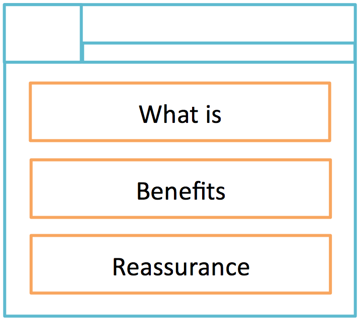
Treat them at the top of the page as if they don’t understand anything about your products and services. Answer their ‘what is’ question.
Then give them detail about the benefits the product gives them. This is the bit that experienced users will dive straight to. You can see this for yourself. Go to a website that you use regularly. I bet you end up focusing on this without considering the top of page ‘what is’ stuff.
Last off, give them reassurance about why you are a good choice.
That’s it
Good web design has a foundation in Psychological and Cognitive bias. You can take advantage of these tendencies to behave in a particular way, and use them to guide visitors to the action you want them to take.
It’s nothing sinister. Its about designing and writing a website that’s easy and logical to use, and helps people carry out the action they arrived to carry out. It’s about making it feel natural.
How have you used these biases on your website? Are there any others we’ve missed? Let us know on Twitter or Facebook.