Higher sales with professional shop design
The visual appearance of your eShop has a fundamental role to play in terms of your success. We’ll let you into a few secrets of shop design….
Place important elements in a prominent position
The most important information that potential customers of an online shop look for – in addition to product details and price – are the delivery details: How long will it take for my goods to arrive? How expensive is delivery? Many shop designers fail to present this kind of information to users in a prominent position. Instead, customers often have to look for it.
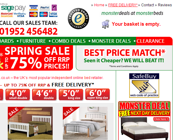
“Free delivery”– Visitors to monsterbeds.co.uk can hardly miss this information
Present this important information in such a way that your visitors cannot miss it. This, of course, applies particularly to the benefits of your shop. If, for example, there are no shipping costs for orders above a certain amount, this is a good selling point and should be visibly placed on the page: on the header or in a separate info box. Somewhere where it will be seen when people first glance at your site.
Avoid experimenting with layout
It goes without saying that you obviously want your online shop to stand out from the crowd. After all, an individual design can ensure that customers remember your shop later. But, you should avoid experimenting with page layout, or how individual elements are arranged on the page. Over the years, various web design standards have become established and customers expect to find many elements of a web page in specific places. Your shop’s main menu, for example, should either be in the top part of the page or along the left edge. Your logo should appear top left. Straying from the norm and with it the very model that users have become accustomed to, can quickly have a negative impact on sales success. Change is not always for the better.
The perfect home page
The home page of your online shop is like your shop window. You should therefore pull out all the stops when it comes to its design. Use the home page to set the scene for buying, for example, high-quality themed images on the homepage enhances your shop. In this way, you can also create space to advertise individual products and promotional goods. You can equally use the home page to suggest categories. You should use large-scale themed images here too.
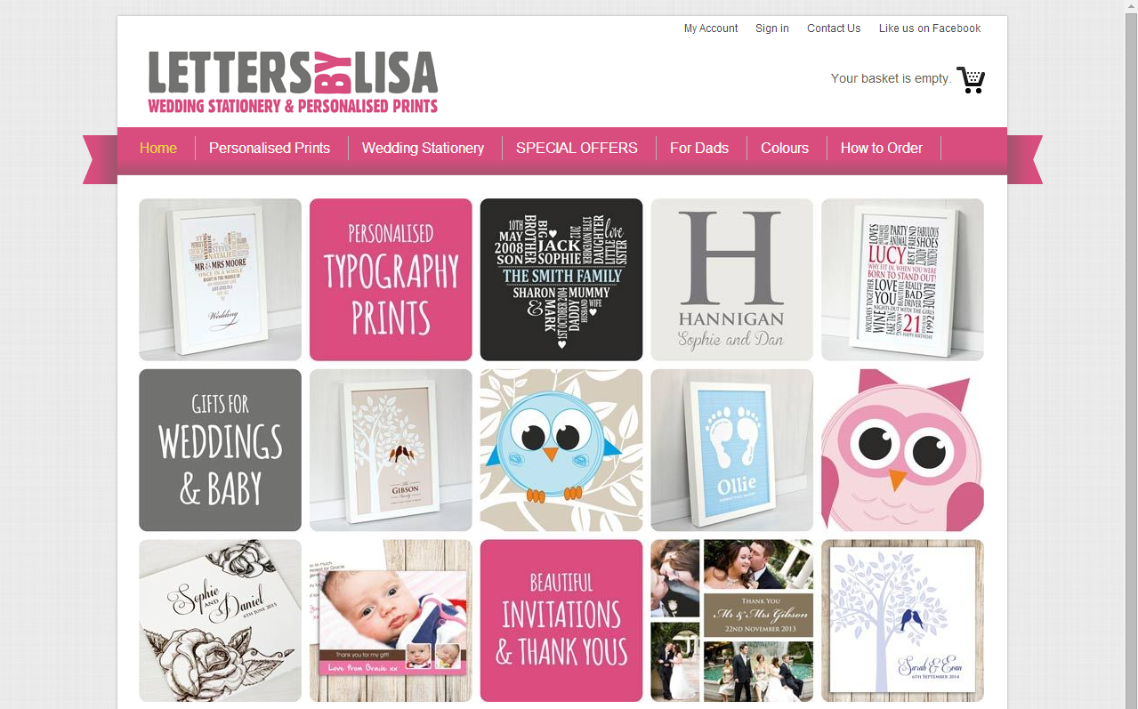
The home page of an online shop with a large themed image
Design to match products and target group
You should always keep two important factors in mind during the design process: your products and your target group(s). The design of an online shop for haute couture, for example, should project exclusivity. In contrast, if you’re selling cosmetics, a clean design with bright colours like the Blossom Cosmeticstest shop would be more appropriate.
Direct user attention
There are elements on many sub-pages of your website that should attract the user’s eye first. On the home page, this can be the promotional products presented here, and on the product pages enticing photos of the goods, or a particularly attractive price. Direct a user’s attention to these elements using a large font size, signal colours or graphic elements like arrows. However, BEWARE: this kind of approach can quickly become too striking and will more likely deter visitors. Always make sure that the user can see the most important elements without having to scroll down too much. Remember to place your most important content in the upper part of the page.