
How are you currently trying to increase your online donations?
Maybe you’re using Google ads or social media campaigns to attract more potential donors to your website. Or maybe you’re reaching out to your email subscribers and asking them to give to your cause. You may even be testing a bigger call-to-action button or different text to entice more people to donate.
These are all great tactics but the chances are your non-profit is losing lots of people right on your donation form.
In fact, studies put the average donor “drop-off” or “abandonment” rate for online donations at somewhere between 50% and 70%. That’s more than half of the people who have found your website and felt emotionally compelled to click the “donate now” button only to find a confusing or time-consuming form that discouraged them from making the donation.
Can you imagine? All that time, effort and money spent on getting a potential donor to your site, only to fail at the very end.
So, how can you improve your donation form to get more people to complete the process and give to your cause? Start with these six best practices.
1. Brand your donation form
There’s nothing that makes the process less reassuring than clicking the “Donate” button only to end up on a page that looks nothing like the site or page you were previously on. It makes you wonder: am I on the right site or have I somehow wandered off-site to some different charity or worse, a spammy site?
You don’t want potential donors to scratch their heads and wonder if they’re still on your site or if it’s safe to enter their credit card details.
So how do you avoid any confusion and make your potential donors feel safe when giving to your organisation?
Easy. Brand your donation form so that it matches the rest of your website. This helps to build trust, confidence and increases the likelihood that users visiting your donation page will actually complete the form.
Here are two simple things you can do to avoid confusion and reassure potential donors that they’re on the right site:
- Use your non-profit’s name and logo at the top of the page
- Stick to the same fonts and colour scheme your website uses.
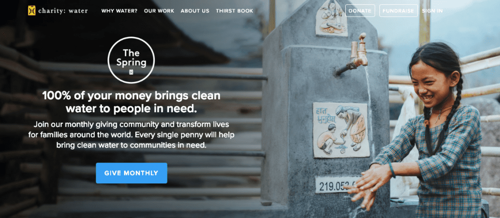
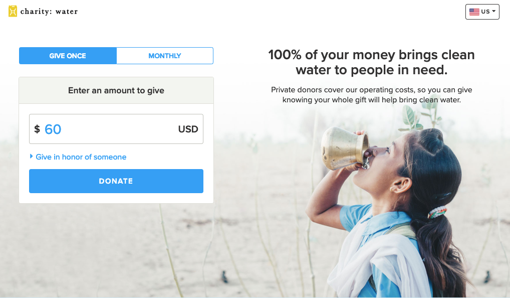
Below is an example from charity:water. If you compare the homepage to the donation page, you’ll notice the consistency in branding, from the message to the colour scheme, fonts and even imagery:
2. Stick to one page
When your donation form expands across multiple pages and donors are forced to click that “next page” button too many times, don’t be surprised if they decide to leave. They might figure that they’ll return when they have more time but the truth is most won’t remember to return.
So if you want to boost donations you need to give people what they want: a quick donation process on a single page that takes a few minutes to complete.
When you keep your donation form to one page, people can easily see what information they are required to complete and determine how long it will take them to fill out the form and donate.
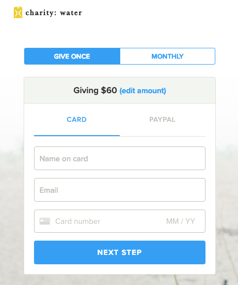
3. Aim for as few steps and clicks as possible
Your donors, like everyone else, are busy people. So if filling out a form to give to your charity pulls them away from other important or time-pressing tasks for too long, they’re likely to abandon the process.
Here’s the thing: getting people to make the choice to donate to your non-profit in the first place is hard work. You don’t want them to leave before giving to your cause just because you think you absolutely need to know their birth date or how they found out about your organisation.
This is not the time to ask unnecessary questions or to ask for additional “optional” details as that will only increase the time-to-completion, add to user frustration and decrease the overall completion rate.
So if you find yourself wanting to include extra fields in your donation form, take a few minutes to determine if they’re truly necessary.
You can always ask further questions or collect more information about your donors after they’ve successfully completed the donation. Consider doing that in a “thank you” or follow-up email that you send after they’ve submitted their donation.
So, make sure to review your current form and see where you can cut down to keep it simple and straightforward, with as few steps and clicks as possible.
To get an idea, the information that’s absolutely necessary includes:
- First and last name
- Contact information, meaning email address and/ or phone number
- Payment details
Check out this example from charity:water:
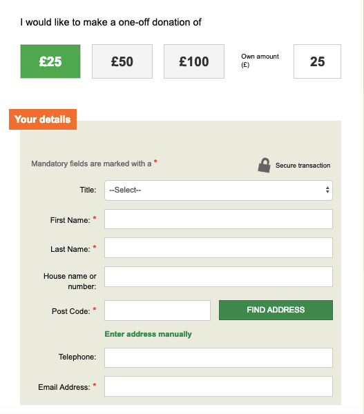
And here’s another one from Oxfam:
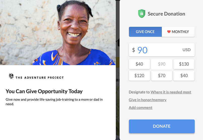
4. Provide donors with suggested giving amounts
Sometimes donors need a little direction when it comes to the acceptable amount they should give or how much is enough to support your cause.
A simple way to guide donors is by suggesting a choice of various amounts so they can decide how much they want or can afford to give.
Start with a minimum amount like £5 or £10 and add a few more options with higher (but not unreasonable) amounts for donors who are willing to give more like £40, £100 or £200, for example.
To help speed the user through the form, display the amounts as easy-to-click buttons like in this example from The Adventure Project:
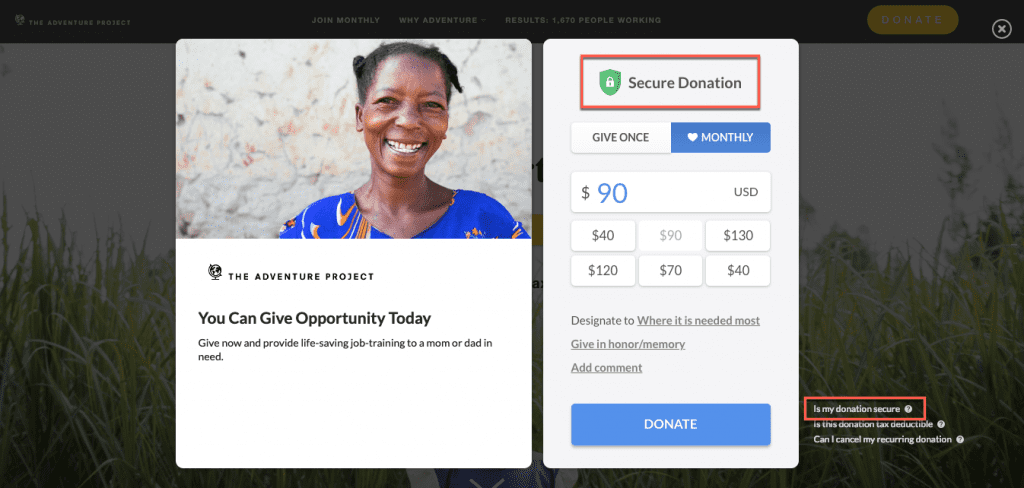
5. Show that your donation page is secure
Security is always a concern when it comes to online transactions. Your donors know the risks which is why you need to show them that you take their online security seriously and that their information is protected.
How? Use and display the logos of the most secure and trustworthy payments processors available to you. This will reassure people that your donation forms are safe to use and that all security measures have been taken to protect sensitive information.
Here’s an example:
In this post you can learn about five secure tools you can use to accept donations via your charity or non-profit website
6. Optimise your donation form for all devices
People are using their smartphones to get lots of things done while on the go, from checking and answering to emails to reading the news and updating their social media accounts.
What does this mean for your non-profit? It means that you need to make sure that donations can be made on the go. If your site isn’t optimised for mobile and if your donation form doesn’t work on mobile devices, you’re likely missing out on a large – and ever-growing – percentage of potential donor traffic.
So what can you do to make sure your donation form is ready for any device? Simplify it by:
- Keeping your donation form on one page
- Using short paragraphs, large fonts and buttons to make the form easy to read and tap on small screens
- Limiting the number of required fields to only crucial information
- De-cluttering the page by removing unnecessary images, icons or other design elements.
In other words, focus on getting the donor through the form quickly, easily and error-free.
Wrapping up
No matter how much time and effort you put into attracting potential donor traffic to your non-profit website, your online fundraising strategies won’t get very far without an optimised donation form.
So do your best to improve yours to make it as professional, attractive and effective as you possibly can. Start by using the tips and advice in this post and see how many more donations you can attract.


