How do you know you’re making the right decisions in terms of user experience? Until you gain some insight into your audience you’ll never know what’s going to encourage clicks and sales.
It can be extremely difficult to predict a visitor’s behaviour on your site or what exactly will sway them to react in a certain way when interacting with your website. You may think your content is highly informative and your conversion path is as streamlined as it can be – but can you ever be 100% sure?
Test rather than just guess…
If there’s a way to know that your website is converting traffic into sales as efficiently as possible, that’s A/B split testing. Not only can you get a better understanding of how real users are interacting with your website but also what you need to change to improve their experience and increase sales. And it’s all based on actual numbers, not just guess work.
For those of you unfamiliar with A/B testing, it’s a method for comparing and measuring two or more alternate versions of the same web page simultaneously and see which produces the best outcome. For example, you can A/B test whether a “Buy Now” (Version A) call-to-action (CTA) gets more clicks than a “Free trial” (Version B) CTA, or if a different colour palette reduces bounce rate. Using A/B testing can help you determine which version is the winner – is it version A or version B – so you don’t have to waste time guessing.
If you’re unclear on how to run an A/B test, make sure you check out our simple guide to getting started with A/B testing which walks you through the basics of effective A/B testing.
Why A/B test?
With A/B testing you can discover how changes to specific elements on your landing page like a different colour or line of copy for your CTA button can influence buyer behaviour. Sometimes, the smallest adjustments can have shocking results like a 336% increase in conversions after running a single A/B test.
The insights stemming from these split tests can drastically improve the conversion rates of your landing pages and the click-through rates on your website’s calls-to-action. Last year’s conversion rate optimisation report from Econsultancy revealed that over two-thirds (70%) of companies carrying out A/B tests saw an increase in conversion rates.
What’s great about A/B testing is that you can run these experiments yourself with services like Optimizely or Visual Website Optimizer, without needing advanced technical skills.
You probably know by now how important A/B testing is. That’s the easy part. The difficult part though is deciding what to test. Let’s look at six excellent yet small and easy to implement ideas that you can test on your website to get those cash register ringing more than ever.
Six A/B test ideas
1. “See Product Video” vs “Watch Demo”
Running tests on your call-to-action buttons should be at the top of your list as it’s one of the most obvious ways to impact conversion rates. Minor changes to colour, copy, font, shape, placement of the buttons can have a surprising impact on visitors’ behaviour.
When it comes to your CTA button text, you should try various power words, pronouns, action verbs and lengths.
Let’s look at the example below:
(See original test Case Study at WhichTestWon)
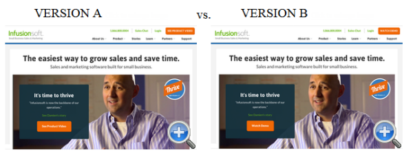
We have two pages, very similar in design, but with one difference: the CTA text.
- Version A (left) – See Product Video
- Version B (right) – Watch Demo
The result? Version A won 48.2% more registration form sign-ups than Version B. Why? Because the word “demo” in Version B made prospects believe that they would be taken to a live demo with a sales representative (which they didn’t want).
2. Changing the sign-up button from green to red
Colour is huge in most A/B tests so you should definitely experiment with different colours to see what works for your CTA. For example, CareLogger increased its conversion rate by 34% simply by changing the colour of the sign-up button from green to red.
There are so many things you can test when it comes to your CTAs. For some extra ideas, make sure you check out the following two resources:
- “Call to Action” Buttons: Guidelines, Best Practices and Examples
- Call to Action Buttons: Examples and Best Practices
3. Changing text link colour from blue to red
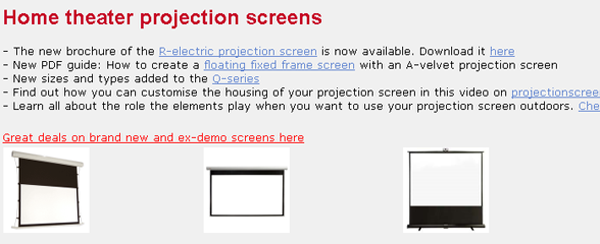
Want to get visitors to click links from your blog post to your product landing page? Try testing the link colour. For example, Beamax did an experiment and changed their link colour from standard blue to red.
This made their links stand out and, as a result, increased link click-through rate (CTR) by 53%!
4. Credit card vs. no credit card
Say you’re selling translation software and to encourage people to buy it you offer a free trial. It’s a common technique to get people to try it and then buy it.
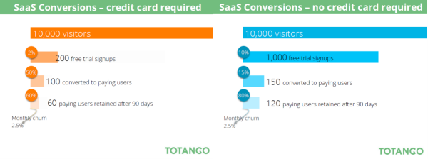
But not all free trials are the same. Some require a credit card upfront to start the free trial, while others don’t. Totango released an interesting study that showed the difference between asking potential customers for a credit card upfront versus asking for it later.
The results? Take a look:
By simply dropping the credit card requirement, they increased sign-ups by 500% and overall paid customers by 50%.
5. Product vs people images
It’s no longer about the quality of the images or how beautiful the imagery featured on your homepage is (although this is still important). You now need to try different images to determine which ones encourage more engagement.
Do your visitors react better to images of people compared to images of products? How about static images versus sliders? There are so many types of images you can test.
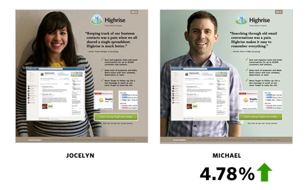
For example, Highrise, a small business CRM, A/B tested their website’s imagery by featuring people on their landing page instead of images of their product. They found that Jocelyn’s picture resulted in a 47% percent increase in paid signups.
Next, they tried featuring Michael, which they found helped increase conversions by almost 5%.
So, make sure you test different types of images on your pages. People versus product is a good place to start but don’t stop there. Go even further by testing gender, age, number of people in the image, etc.
6. Remove distractions
If you already have a busy page with loads of products, consider removing any extra distractions. If your page is too busy, avoid adding sale banners or anything else that might distract visitors from their path for final sale.
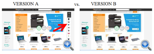
For example, eBuyer tried adding a “Popular products” navigation window to make it easier for visitors to go directly to top-selling product pages from top funnel pages. They believed that adding a social proof element would help convince bargain hunters to buy.
Here are the two versions they tested:
The result? Version B, the variation without the Most Popular products module increased revenue per visitors.
It works for them, so it will definitely work for me…
These are just a few ideas that you could test on your website but there are many more.
One thing you need to keep in mind though is that while these ideas have worked for some sites, it doesn’t necessarily mean it will work for yours. The only way to see if an idea works on your site is to A/B test it and see the impact on conversions.
Most importantly, keep an open mind and don’t ever stop experimenting and testing with all sorts of ideas. Keep the process continuous so that you’re always navigating your web pages’ blind spots.
Further reading
If you want to delve deeper, here are three resources to help you become an A/B testing pro:
- The Ultimate Guide To A/B Testing: A useful (and very detailed) guide on everything A/B testing.
- The simple guide to getting started with A/B testing: A practical guide that walks you through the basics of effective A/B testing.
- Which Test Won?: A fantastic game that challenges you to guess which variant won in a test. You can also go directly to the results and see which variant increased conversions and why.
Have you found success using A/B testing? Tell us what you tested and what results you got in the comments below.

