

So many marketers are talking about the death of the sales funnel but I have to disagree. We are actually evolving from a traditional “company-centric” brand approach focused on funnels that end in transactions to a “customer first” content marketing approach that focuses on developing mutually beneficial relationships.
In the digital age, the chances of customers travelling the predefined traditional sales funnel are slim. Instead, they come in and out at different stages of the funnel. What’s more, their buying behaviour is so unpredictable that it has become a common scenario for them to go silent for days or even months before they come back and purchase.
However, the general stages of the traditional sales funnel are pretty much the same. What has increased is the influence and power of content in guiding leads through the sales funnel until the intent to purchase is clear. Even after a sale has been made, content still plays a major role in ensuring that the new customers is not only happy with his purchase but is also interested in becoming an advocate of the brand.
In this post we’ll show you how you can use content marketing at every stage of the sales funnel in order to attract more visitors to your site, turn them into paying customers and hopefully evangelists of your brand.
The power of content
Can content get you more sales? The answer is yes but only if your focus is on creating content that:
- Answers people’s questions
- Generates interest
- Overcomes objectives
- Builds a relationship of trust
People are now more informed and empowered than ever which is why they will almost always choose brands that inspire them with great content. By now, they are smart enough to tell if your marketing is built around their needs or around your sales agenda.
Content is so powerful and a critical ingredient in virtually every sales funnel. You need content if you want to:
- Attract prospects to your site (think blogging)
- Turn prospects into leads (think free reports, webinars or other exclusive content that allows you to capture email addresses)
- Turn leads into customers (think newsletters that help you to build a stronger relationship with your customers)
Great marketing has always been (and will continue to be) about great content. But before you start writing tens of blog posts, landing pages, case studies and the like in the hopes that visitors will immediately visit your site and buy your stuff, you first need to put together a content strategy. This will allow you to target prospects with unique, stage-specific content that can help convert them into leads and then into paying customers.
Learning how different types of content target different parts of the funnel is key to an effective content marketing strategy. With that said, let’s take a closer look at the six essential steps to attract visitors and turn them into paying customers with content.
The six steps to customer acquisition
There are five steps that most every customer goes through before deciding to buy. If you’re successful, one more will follow.
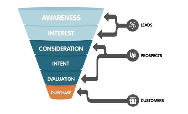
Top of the funnel – Leads
1. Awareness
2. Interest
Middle of the funnel – Prospects
3. Consideration
4. Intent
5. Evaluation
Bottom of the funnel – Customers
6. Purchase
Content for leads
Two stages of the content marketing funnel fall under this category: awareness and interest. Let’s see how you can target each of these stages and what types of content you should use.
1. Awareness
This is the first time that leads hear about you or come in contact with your brand. This makes it the ideal place to educate them and not about a specific product, but about topics that matter the most to them or their businesses. It’s where you can start building trust by answering questions on topics that are relevant to them as well as to your brand.
So, your content needs to be optimised for search engines so it’s easier to find as well as entertaining and educational in order to keep prospects engaged. This is the perfect place to work in some humour and show a bit of character.
A good idea is to create and publish content on other sites that are high quality and relevant to your industry. Find out where your potential customers might be spending time online, where they’re getting their news and information and try to get your content in front of them.
The goal is to move prospects from limited knowledge (“Who is this company?”, “How can they help me?”) to a greater degree of proficiency while leaving them wanting more (“This company is amazing. I want to know more.”).
2. Interest
At this point leads have come into contact with your brand, whether by word-of-mouth, social media, an ad, or a blog post. Your message has piqued their interest. Now that you have made a great first impression, they’re ready to go to the next stage of the funnel.
The best way to take advantage of those increased attention spans is to get them to start asking themselves whether they’re interested in what you have to offer. At this point they’ll want to find out everything about your company and what you have to offer.
Make use of landing pages, infographics, video content, social media content to engage them even further and make them see how they can benefit from buying your product or service.
Some good content for leads can be:
- Landing pages
- Blog posts
- Guest posts
- Videos
- Ebooks
- Reports
- Infographics
- Social media posts
- Q&A sites like Quora
Content for prospects
Your leads have shown interest. They might have requested more information via one of your forms, signed up to your mailing list, downloaded an ebook, and maybe even mentioned you on Twitter. While leads are still not qualified, they are getting close as they’re now considering your brand as a viable option.
So, the content you serve at this stage needs to be more in-depth and detail how your product can help solve a specific problem.
3. Consideration
People have now read some of your content, enjoyed watching your marketing videos and maybe even engaged with you on Twitter or Facebook.
Now that they know a bit more about your company and have realised that a product like the one you’re selling might be useful, their next question will be whether they can trust you or not.
This is where you will need to invest most of your time and resources into creating amazing content that will not only set you apart from your competition, but also that will help position yourself as an expert in your industry.
Free advice in the form of how-to blog posts and videos, case studies, ebooks can help you build trust as it shows prospects that you care more about helping them than you do about making a sale. At this point you can also encourage prospects to sign up to your mailing list with the promise that you’ll continue to share valuable content with them.
4. Intent
Once you’ve demonstrated your expertise and willingness to help, prospects will be far more serious about your brand. But that doesn’t mean they’re ready to commit to making a purchase.
You now have to convince them that buying from you is the smart thing to do. So, the next step is to provide more information that reassures them they are making the right decision choosing you over your competitors. The content you provide at this stage needs to be more specific such as white papers, ebooks, webinars and FAQs.
5. Evaluation
Prospects are now only a step away from making a purchase. At this point you can reassure them that your product is the best there is by providing reviews, testimonials, product demos, data sheets for comparison, case studies that show how you’ve helped others to achieve their goals.
Some good content for prospects can be:
- Blog posts with more in-depth content
- Buying guides
- Product demo videos/webinars
- Case studies
- Data sheets
- Product comparisons/ pricing guides
- Brochures
- FAQs
- Testimonials
- Email newsletters
- Consultations
Content for customers
By the time a prospect reaches the bottom of the funnel, they are about ready to buy. Often times, they just need a gentle nudge to get them to take action.
To help speed up the closing of the sale, you could throw in some offers like free trials, discounts, gifts, exclusive offers and content.
Sales and conversion pieces may include:
- Free trials
- Coupons/offers
- Product demos
- Follow-up consultations
- In-depth blog posts or articles
- Input from current customers/advocates
The work doesn’t stop once the purchase has been made. Now you need to work on retaining the customers you have just landed. It’s true what they say – keeping a current customer is much easier (and cheaper) than attracting new ones.
Once you retain those new customers, delight them with great offers and discounts, exclusive content and anything else you can think of. If they’re happy, they’ll soon begin to support your brand, which is what all brands want.
There’s no ‘right’ content marketing funnel
Creating content that aligns with each stage in the funnel is great. However, it’s also likely that very few prospects will actually enter the top of your marketing funnel and then follow the predefined path that you have created for them all the way through to conversion.
Today’s customer journey is pretty fragmented and they can find you in many different ways, on different devices and at different times, online and offline. It’s your job to be ready.
How do you convert leads into customers and then into repeat buyers? Share your tips with us in a comment below.


