
Do you blog about travel, food or parenting? If you’re passionate about it, you’re probably wishing more people would discover your blog and engage in conversation. Because while sharing your personal stories and advice with family and friends is great, having a big, diverse readership and building a community where others share their comments and experience is what makes blogging thrilling.
So, how can you grow your blog? How can you get more people to discover it amongst the hundreds of millions of blogs out there?
Well, just as writing is critical to keeping your blog alive, so is promoting it. Because no matter how passionate you are about your topic of choice, and no matter how entertaining or insightful your articles are, if your blog is like a ghost town, you’ll soon lose the motivation to keep going.
So, to help get you started with blog promotion, we’ll show you ten ways to spread the word about your online space and attract more readers to your blog.
1. Optimise your posts and images for search engines
Building a personal blog today is like building a cabin in the middle of a deserted forest. No one knows you’re there. Perhaps a hiker might run across your little cabin, but that would just be luck. With more than 400 million blogs in the world, are you sure you want to rely on luck to get discovered?
The first step to promoting your blog is to optimise it for search engines. This increases the chances of people finding your blog in the search results when they’re looking up travel blogs or parenting advice.
So whenever you publish a new post, make sure it’s properly optimised for search engines. This guide on search engine optimisation for articles explains how to optimise your WordPress blog posts. You’ll learn how to research which keywords to use and how to optimise every element of a blog post, from the title and the meta description to the actual article.
Now, one important step you should never skip is image optimisation. You may not realise it, but images are the unsung heroes of traffic generation. In fact, a 2017 report by Jumpshot & Moz revealed that 27% of all searches are for images. That shows you how big of a traffic chunk images are receiving, and how much you could be missing out if you’re not optimising your images for search engines.
2. Become active in the blogging community
You’re not the only one who had the idea to start a blog about travel, parenting or fitness nutrition. But instead of treating those other blogs as your competitors, why not treat them as your friends and allies?
In fact, reaching out to other bloggers within the same niche can help you to promote your own blog, to reach a wider audience and even to inspire new article ideas.
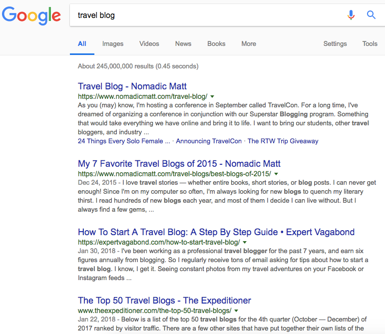
Start by running a search on Google for blogs within your niche. For example, this is what shows up when running a search for “travel blog”:
The next thing you should do is to visit those blogs and start engaging in conversation. This means following those bloggers on Facebook, Twitter, Instagram or wherever else they’re active online, leaving a comment or sharing an article on your own social channels while also tagging the blogger in the post.
The idea is to build a relationship with these bloggers so they also get to know you, read your blog and share your articles with their audience.
3. Use comments to your advantage
The idea of commenting on other blogs as a promotion technique is an old idea, yes, but it still works if you do it right. And doing it right means adding a comment only when you have something of value to add to the conversation.
A comment becomes spammy when its only purpose is to get a link in there, hoping hundreds of visitors will click it and discover your blog. This rarely happens nowadays, so don’t be that person as you’ll only alienate potential readers.
Instead…
- Add a comment only if you have something interesting or helpful to say.
- Link to your blog article only if it makes sense and if it adds value to the conversation. For example, if you’re commenting on an article about countries in South America worth visiting, and you’ve written a post about your experience in Colombia, then yes, definitely share it.
A quick thing you can do to stay updated on newly published blog content is to set up Google Alerts. If you’re not familiar with it, Google Alerts is a tool that notifies you to content related to your topic being published across the web.
To use it, go to Google Alerts, add your keyword or topic and then tick the “Blogs” option so you’ll only receive results from blogs.
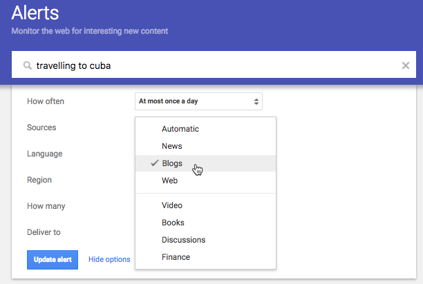
This is a simple way to get notified when new blog content on your chosen topic gets published so you can then visit that blog and be an early commenter.
4. Answer questions in forums or groups
Posting in forums and groups is a great way to net yourself a piece of the pie more quickly. There are countless forums and groups filled with people exchanging ideas and looking for the next big blog to follow.
This is a fantastic feeding ground of knowledge and potential, so jump on in and swim with the sharks because you have more in common with them than you think.
A common forum that everyone loves is Quora. To use it, type in your keyword to see a list topics. For example, here are the topics related to “parenting”:
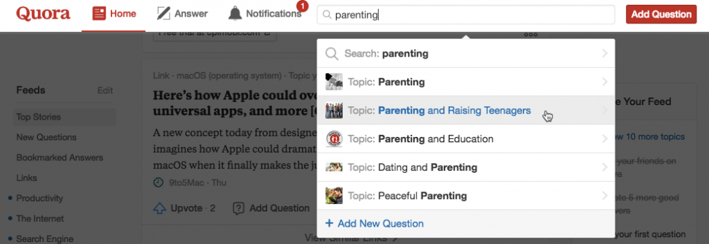
Now simply pick a topic and see the list of questions you could help answer. If you’ve also written a blog post that answers that question, make sure to link to it in your comment.
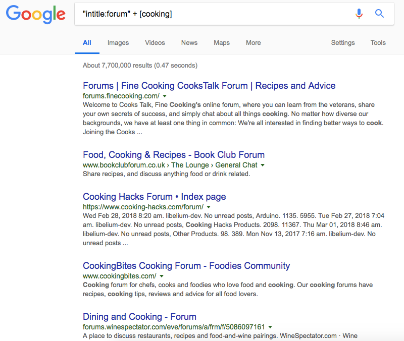
There are also other forums and groups you can use. To find them, run a search on Google using this search formula:
“intitle:forum” + [your niche keyword]
Here’s what it looks like when I try to find cooking forums:
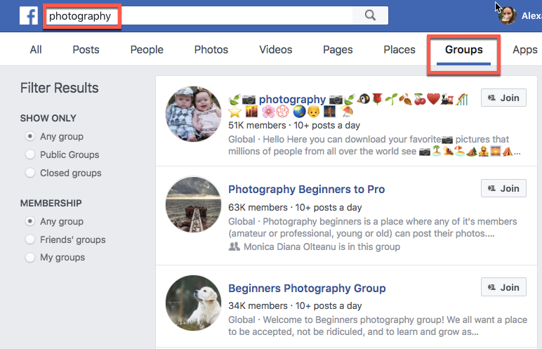
Other groups that are becoming more and more popular are Facebook groups. If you’re already using Facebook to promote your blog, then the next step is to join Facebook groups that exist for your niche.
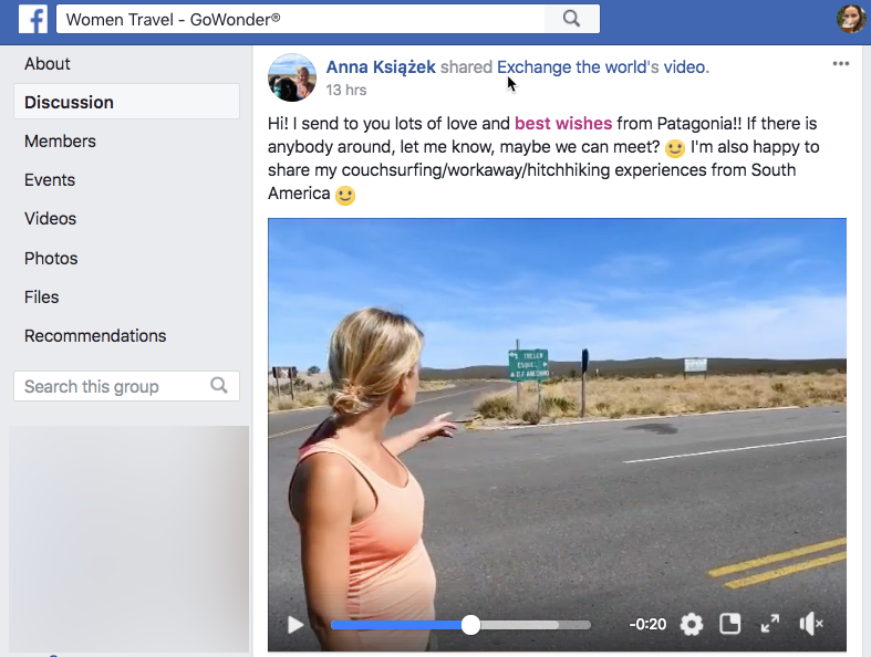
These groups are made up of individuals who not only share a common interest, but they’re also often highly engaged, knowledgeable and willing to help. They ask and answer questions, share images, videos and links to their own or others’ blogs. They enjoy being part of the conversation and are always happy to share their experiences and advice. This is a big part of your audience, so make sure to join in.
Here’s an example of a post from one of the travel groups I’m part of:
If you have the time, you can do one better and start your own Facebook group. But if you don’t, simply go to your Facebook, run a search for your topic of interest and click “Groups” to find relevant groups to join.
Just make sure that once you join, you become an active participant so members get to know you and start reading and sharing your blog posts. It’s the only one you can gain exposure and entice people to read your blog.
5. Share your content in many places
If you go through a lot of effort to create great content, then do yourself a favour and share it, republish it, and pitch it to more than one place. Great content deserves to be shared with more people, and the best way to do that is to share it on more places, and not just Facebook.
Here are the big ones that you don’t want to miss out on:
- YouTube
- Vimeo
Sharing your blog posts on the networks you know your readers are using is smart. Just make sure you’re also active on these platforms and that you use them to interact with people, and you don’t just share one blog post after another.
6. Use hashtags to help people outside of your circles find your blog content
If you’re not familiar with hashtags, a hashtag is a word or a phrase preceded by the hash mark “#” and it’s used to organise and to keep track of similar information around a particular topic.
Why use hashtags? They’re a great way to tag your content and to increase the chances of people finding it on social media. Think about it – what better way to filter social media buzz and gather your audience around topics of interest than hashtags?
So whenever you’re sharing a new blog post on social media, add a few hashtags that are relevant to the content of your article to help more people discover it. For more information, read our guide to learn which hashtags to use (and how) across the most popular social networks.
7. Go live
What better way to get more eyes on your blog than using video or Facebook Live? Get in front of the camera and talk about your passion and your blog.
If you have a travel blog, you can do a live video about your next travel destination. And if you have a cooking blog, you can do a live video where you show people how to cook those delicious scones. If you also have the written recipe on your blog, make sure you link to it in a comment.
There’s so much you can do with video and Facebook live to promote your blog. For more ideas, check out this article that explains how Facebook Live works and ways to use it to reach more people.
8. Interview or be interviewed
Your readers are out there and they don’t know about your travel blog. But they are listening, watching or reading… other travel blogs. So, how can you get their attention?
- If you see guest posts on a blog, ask if you can be one of them.
- If you find a podcast that does guest interviews, the chances are you can easily get on that guest list too.
- If there’s an influential blogger in your niche and they’re doing all sorts of “top travel bloggers” lists or interviews, get in touch and see if you can be part of them.
So, get out there and find places outside your blog where you can share your experience and knowledge. It’s a great way to contribute to the conversation while also spreading the word about your own blog.
9. Make your posts easy to share
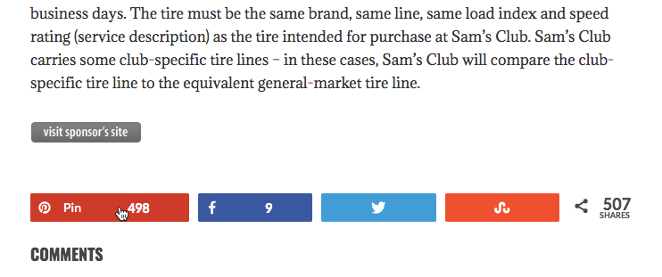
One of the easiest ways to promote your blog is to have readers do it for you. And the best way to encourage them is to have your social sharing buttons in plain view.
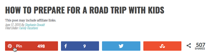
For example, this blogger has chosen to display social sharing buttons at both the beginning and the end of the article:
Here’s an example:
Whether you do the same or not, that’s no important. The important thing is to make sure you give readers a quick and easy way to share your blog content.
Here are 15 popular plugins for WordPress you can use to add social sharing buttons to your blog.
10. Build your email list
The moment your blog goes live you need to start building your email list. Why? Because your subscribers will be your biggest fans and most loyal readers.
So whenever you publish a new blog post, you can email it to your subscribers so they’re the first to read it, and hopefully to share it with their friends.
Don’t know how to get started? Don’t worry as our beginner’s guide to building your first email list walks you through all the steps to follow to get readers to sign up to your list. You can also take our free email marketing course to help you get started.
Wrapping up
It’s not enough to be passionate about a topic to get your blog found, read and shared. If you want to get more readers to your blog, you need to take the time to promote it. That’s when you get rewarded with a bigger, more engaged community of people who will also tell others about your blog.


