Mobile Matters: Why You Need a Mobile-Friendly Website (and How to Get One)

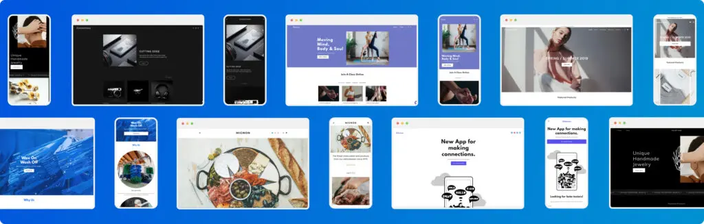
A mobile-friendly website is one that’s been designed to work just as well on smartphones as it does on desktops. The idea is simple: visitors should have a great experience, wherever they are. More people browse on their phones than ever before. Be it searching for information, shopping, or booking services, smartphones are the go-to device for most of us today. That means any business website needs to be as easy to use on a mobile screen as it is on a desktop—or even more so. What is a mobile-friendly website? More people browse on their phones than ever before. Be it for shopping, searching for information, or paying for services, smartphones are the go-to device for most of us today. That means a website needs to work just as well on a mobile screen as it does on a desktop. One way to do it might be to create separate websites for each device. But this approach is bound to take up more time and resources. And today’s visitors expect a smoother ride. A smarter way is to create a website that knows “where it’s at” and can adapt itself to fit a mobile device. This is achieved using a technique known as responsive design. What’s the difference between being mobile-friendly and mobile-ready? “Mobile-friendly” and “mobile-ready” are often used interchangeably to talk about the same basic idea — and that’s fine. For geeks, there is however a slight technical difference: ☐ A mobile-friendly website is one that can adjust its layout and elements (like buttons and menus) to fit mobile screens. Images resize, text reflows, but the site itself doesn’t change; only the way it appears on different devices does. ☐ A mobile-ready website is an entirely separate site with its own web address or subdomain (think “m.example.com”). This approach has been going out of fashion in recent years because of the added costs and headaches involved in running separate sites. So then, what’s responsive design? The answer is that responsive websites can try to change their layout and elements to fit all different screens — not only mobile, but other devices. In short: all responsive websites should be mobile-friendly, but not all mobile-friendly websites are responsive. Why mobile-friendliness matters Responsive websites adjust their layout on the fly, making them work across a range of devices—not just tablets, but also smartwatches, TVs, and even the whole internet of things. But mobile matters most. Over half of all internet searches now happen on phones. The share is even bigger for online shopping. Google prefers mobile, too, giving higher search rankings to pages optimised for smartphones. So while a smooth mobile experience is important for all website owners, it’s essential if you run an online business. Luckily, there are platforms that take care of everything for you. How do they make websites mobile-friendly? Think about how users browse on phones — limited screen space and often on the go. When a website is mobile-friendly, the aim is to bring a smooth and easy user experience to smartphones, and generally to tablets as well. Content needs to be presented in a way that’s easy for mobile visitors to make sense of. That means readable text, clear and concise info, and easy-to-navigate menus with clear buttons and menus, so users can find what they’re looking for. Fast loading times are important for any website, but even more so on mobile. Images can be compressed and resized, cutting out the waiting times that could cause visitors to bounce. Mobile-friendliness also means putting the most important things, like contact information, special offers, and clear menus, right at the top for quick access. This way, users can find what they need fast and easily. ✔ Font size and readability: Large, clear text for ease of reading on small screens. ✔ Simple layout: No clutter, easy to navigate, simplified menus. ✔ Fast loading: Quick page views for impatient users, with condensed images. ✔ Tap and scroll friendly: For easy interaction with touchscreens. ✔ Big CTAs and CTCs: Extra-prominent ‘Call to Action’ and ‘Click-to-Call’ buttons. Why do I need a mobile-friendly website? 1. Web Browsing and Online Shopping Trends Almost 8 billion people use smartphones worldwide. That’s reflected in web traffic, with over 60% of hits coming on mobile devices. The slice is bigger when it comes to online shopping purchases, and even more so during holidays like Christmas, when consumers tend to use their smartphones for last-minute deals and on-the-go info. In the UK, over 93% of the population uses mobile internet. That’s just over 63 million mobile internet users, according to Statista. With more and more customers doing their browsing and shopping on smartphones, British mobile commerce sales are predicted to surpass £100 billion by 2025. 2. Improved User Experience The internet is increasingly mobile-centric. There’s been a shift in how people consume content, with a preference for bite-sized, easily digestible information. Modern consumers expect a smooth and user-friendly experience when browsing products or services. In fact, 57% of internet users say they wouldn’t recommend an online business with a poorly designed mobile website. Mobile optimisation brings users the experience they need. Speed matters for all websites, but it’s especially important for on-the-go visitors who might have slower connections. 47% of users today expect a site to load in no more than 2 seconds. 3. Lower Bounce Rates, Higher Conversion Rates Mobile optimisation helps reduce bounce rates and leads to higher conversion rates. Studies suggest online shoppers are 67% more likely to make a purchase from a site optimised for smartphones. If your homepage isn’t easy to use on a phone, they’ll go somewhere else! Mobile-friendliness can give your online business a competitive edge, with potentially up to 40% higher conversion rates than non-optimised sites. Users are more likely to stay on a site that is easy to navigate and provides a positive experience, driving conversions. Being mobile-ready also helps your brand image. It shows that you’re modern, professional, attentive to needs — rather than turning
Usability: Nielsen’s view
User experience between the desktop and the mobile device Tips from user interface guru – Jakob Nielsen Jacok Nielsen is an expert when it comes to web usability and user experience. He’s actually the founder of usability science and his contribution has helped a lot in understanding how human-PC interaction works. He recently published a few reports on mobile usability and his research turned out to be very insightful, as usual. In a recent interview, Nielsen pointed out the key differences between the user’s behaviors when accessing the Internet from a PC and when he’s accessing it via a mobile device. The usability guru explains that mobile users are less committed and less focused. That’s because they’re using their phones while on the go – while waiting for the bus, while watching TV or while shopping – which means that this is actually not their primary activity, so they’re not 100% focused. App vs Site Nielsen also talks about the advantages of apps over sites, which he states are a lot faster and include plenty of features that people enjoy using, such as location. Nielsen recommends Using larger touch targets – such as links – so mobile users can easily tap on it and navigate to another page. Eliminate the nice-to-have content or design elements and instead focus on including only what’s relevant for the users. He says that “when everything is prominent, nothing is prominent”. Include little content. Short copy is too long. It should be ultra-short, he explains. In conclusion, when it comes to mobile usability include as little content as possible, but enough to engage with your mobile users. Check out Jakob Nielsen’s website for more great resources on web and mobile usability.
Writing for mobile is twice as difficult
With so many people using a mobile device to surf the net, it’s important to know how to write and organise the content on your site so it’s user-friendly. When was the last time you checked how your site looks and reads on a mobile device? This is not something to be ignored as the number of users getting their daily dose of web information on the move is constantly increasing. This article aims to help you do a better job at writing content for mobile. It’s not scientific, just a few tips that can really make a difference. What do mobile users really need? Most people believe that the mobile version of your site should just condense all the information from your current site. In my opinion, that’s totally false! Why? Because condensing so much content in an effort to make it look better on a mobile device can actually act against you. Users might have an even harder time finding what they’re looking for. The purpose is to keep it simple and give your visitors exactly what they need. You might need to do some research and determine what exactly these mobile users are looking for on your site. Instead of just copy and pasting the content you currently have, work around it and only include the information that’s relevant to mobile users. Focus on their needs rather than on a good-looking site. Remove the unnecessary For mobile users, time is of the essence. They need to find information fast, so be sure they won’t have time to read the About page if all they want to do is buy a train ticket, or check if there’s a delay on their flight. Instead of including redundant content and using a small font so it all fits in, focus on filling that little space with useful information. Don’t overlook SEO It might be a mobile device they’re using to access your site, but search engines work the same regardless. This means that you shouldn’t forget about optimising the content on your mobile site with strong and relevant keywords. Make links visible With so many accessing the web using a touchscreen device, it’s important to make it easy for them to just tap on a link to get on a page. Work with your designer so that links are visible and can easily be clicked. In conclusion, when writing for mobile always think about your visitor’s needs and find ways to make their stay on your mobile site as enjoyable as possible.