Small business owners simply can’t do without a website these days. Your customers are out there online — and they may be looking for a company like your own. But what’s the simplest way to get your business online if you’re not tech-savvy, you don’t have the time to learn coding, and can’t afford to hire someone to do it for you? The good news is that you can build a website yourself without getting bogged down with any technical details and jargon. There’s no need to become a coding pro: you only need WordPress.
Why WordPress?
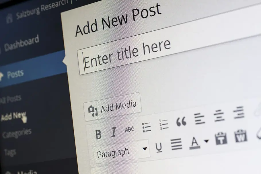
If you’re not familiar with WordPress, it’s a content management system (CMS) that lets you create, manage, and publish content on a website.
Content includes everything that’s on your site – from the words you use to describe your products and services to images, videos, contact forms, and more.
Why use WordPress? Because it’s one of the most popular CMSs in the world. And the reason it’s so popular is that it’s easy to use, even by people with no previous technical skills. This means you won’t need to worry about messing with lines of code if you want to change the colours, text, or images on your site.
Read this post to learn about six good reasons to choose WordPress for your website.
Choosing the right WordPress hosting
Hosting is where your website “lives”. When you visit any website, you connect to the host which then sends relevant data to your browser. Without hosting people won’t be able to visit your site.
If you’re planning to launch a WordPress site, the chances are you’ll want to pick a specialist WordPress hosting package.
Specialist WordPress hosting is optimised to run the CMS, which can mean your site will perform better than it would on a hosting package with comparable resources.
Plus, a good WordPress host will take care of some of the important yet time-consuming tasks that are related to running a WordPress site.
With 123 Reg’s WordPress hosting, we take care of:
- Installing WordPress with your hosting so you can use it right away.
- Automatically keeping your site up to date with the latest WordPress updates.
- Continuous speed optimisation so your site loads quickly for your visitors.
- Regular backups and malware scans to ensure that both your business site and customers’ visits and sensitive information are kept safe and secure.
Your hosting package also comes with free email address, domain name, and an SSL certificate to ensure a safe browsing experience for anyone who visits or buys from your site.
Creating your first WordPress site
You’ve got your affordable domain name and you’ve got your WordPress hosting package. So what do you do now? If you’ve spent some time getting to grips with the basics of your fledgling WordPress site, you’ll have already realised that although the default setup is good enough for a personal blog, your business project will need something different.
Fortunately, WordPress is a powerful tool which can be adapted to the needs of any business. It does this by using easy-to-edit templates, which dictate the look of your website, and plugins, which add extra features to your site.
Let’s look at the steps you need to follow to get your first WordPress site up and running.
Planning your site
Before you dive in and start tinkering with your WordPress site, it pays to draw up a plan of how you want it to look and what you want it to do. Without a plan, there’s a chance you’ll lose track of your aims and end up with a website that isn’t suitable for your business.
Make a list of the features your website must have. You’ll also want to sketch out a basic site map to give you an idea of what content you’ll need and how the site will fit together.
If you’re unsure about what your business site will need, then take a look at this guide. We won’t be talking much about content in this guide, instead we’ll focus on creating a bespoke site that looks good and is ready for you to add your content. Alternatively, if you already have a WordPress site then this guide will allow you to improve the way it looks without losing any of your content.
Once you’ve got a general idea of what you want your site to do and how you want it to look, it’s time to begin putting together a collection of resources that will help you build the site you need. Of course, if you’re a business just starting out then money may well be scarce. For that reason, we’ll focus on resources that are either free or very cheap. Let’s start with the most fundamental building block of your new WordPress site, the theme.
Choosing a theme/template
What is a WordPress theme (sometimes called a template)? Put simply, it’s the template that defines how your site looks. Installing a new theme will change the appearance of your site but it won’t change the fundamental content of your site (although you may find that changing the theme of an existing site means some content goes missing or can’t be displayed correctly). Picking the right theme is a vital first step in ensuring your site looks the way you want it to.
How can you go about picking a theme that’s right for you? Well, the first thing to do is go back to the plan you’ve drawn up for your site. If a theme doesn’t offer what you want, then you can remove it from your shortlist straight away.
Then there’s personal choice – you’ll instinctively like some themes more than others and that’s fine. Of course, you should also bear in mind what potential customers will think of your site, so you may want to ask others what they think about the themes you’re contemplating.
Here are some other things you should be looking for in your WordPress theme:
Customisability – How easy is it to change the theme’s look? Will you be able to change the colour of the theme, for example? If a theme can be easily customised easily you can give it your own twist without getting to grips with CSS. In fact, you won’t even need to know what CSS is.
Mobile friendly – Your theme should be mobile friendly. (If you’re not sure why, then check out this article on the importance of mobile-friendly websites.)
Compatible with the latest browsers – Make sure the theme will look good in modern browsers.
Compatible with your version of WordPress – Make sure the theme will work with your version of WordPress.
All of this information should be contained in description of the theme you’re considering. Many sites will also let you see a preview of a theme, so you can get a good idea of how your site will look once you’ve picked a theme, you may find it beneficial to go back and update your website plan and base it specifically on the theme you’ve selected.
Pro tip: Use prebuilt professional templates.
A quality WordPress hosting package will give you access to free, professionally designed website templates. You can then browse through the collection, select the one that’s most relevant to your business and industry, and quickly use it with your website.
For example, if you’re a plumber, you may want to use a template that lets you include customer ratings and testimonials or a contact form on your homepage.
Here are some more tips and advice on how to choose the right WordPress theme for your website.
Branding your new theme
Once you’ve selected your new theme, you want to make it unique to your business. This will ensure that customers view your business as unique and your website doesn’t feel generic. Branding is a complex subject, and you can get to grips with it here.
Before we get into what you’ll need to change, we need to talk about widgets. At least some of the customisation you do to your new theme will be done via widgets (the rest will be done through the theme’s settings). WordPress widgets are great because they allow you to make changes to your site without having to do any coding.
WordPress incorporates a visual editor, which makes it easy to see the changes you’re making to your site.
Add your logo
Your logo is your business’s ID badge, so make sure people can see it. It should feature on every page, so make sure it’s there. Many themes designed for business have a specific option for you to upload your logo. If you don’t have a logo, then you can learn about why it’s so important in this guide.
Brand it to your colours
If you’ve developed brand colours, then you’ll want your website to use them. If you’ve picked a theme that’s easy to customise, this should just be a case of inputting the right hexadecimal codes in the right places and clicking save. Again, hexadecimal colour codes are something you don’t need to fully understand before you use them. If you’ve got a brand colour scheme but don’t know the relevant codes, then you can use this simple tool to discover them. If you don’t have a brand colour scheme, then you can develop one quickly and easily with Paletton.
Add new fonts
If you’ve gone the whole hog on the branding front, you’ve probably selected brand fonts. If you haven’t, now is the time to pick some. Selecting two or three fonts can add an extra personal touch to your site. You can find a guide to selecting fonts that work well together here. If you use Google Fonts, then this plugin will install them on your WordPress site. There are plenty of other fonts plugins out there too. Not sure what a plugin is? We’ll talk about that in a second. You can also add fonts to WordPress by uploading them to your theme’s folder.
Source high quality images
After you’ve branded your website, you need to think about the other major visual aspect of your site – images. WordPress is a highly visual platform and you can add photos and images almost anywhere. If the theme you’ve selected uses background images, slider images or something similar then you can’t consider your site finished until you’ve uploaded pictures.
You can get in depth tips on what makes a good image here, but the general rules to follow are:
- Avoid staged stock photos
- Use photos of your business wherever possible (eg staff, customers, products, premises)
- Never use copyrighted photos if you haven’t licensed them
Get to grips with plugins
Plugins and widgets are a great way to add extra features to your website. Put simply, if you want to add a feature to your WordPress site, then there’s probably a plugin for it. You can learn about plugins and some your site will definitely need in this guide.
Add content using WordPress’s intuitive text editor
One of the great things about WordPress is how easy it is to add content to your site. Its text editor works just like a word processor which means it’s easy to add written content to your new site.
Exactly what written content you need to add depends on your template and the kind of site you’re creating.
You’ll certainly need to add text to your navigation menus and your key webpages (which could include product pages, an about us page and a contact us page).
This guide explains how to add content to WordPress. You can read this guide for more information about the kind of content your website will need.
Secure your WordPress website
Any website is a potential target for hackers and spammers and WordPress is no different. Fortunately, it’s relatively easy to protect your WordPress site.
As well as the basics of web security, such as strong unique passwords that aren’t shared with anyone, you should also consider using a website malware scanning tool.
You’ll also need an SSL certificate to protect any data your website visitors input on your site.
123 Reg’s WordPress hosting packages come with a free SSL certificate and free malware scans to help protect your website.
You can learn more about WordPress security in this guide.
Experiment
If you haven’t yet launched your business website, then you’ll never have a better chance to experiment with how it looks. Try adding features, moving features to new locations or even removing features.
Ask friends or potential customers to test drive your site to see if they can navigate around it easily. You should also remember that your website will never be perfect – you should expect to keep changing things even after your site is live.
To understand why you need to do that and how to go about it in the right way, check out this guide to A/B testing.
Summing up
Launching your first WordPress website can feel overwhelming, but with a little planning and a willingness to get to grips with new skills you’ll find that it’s probably easier to do than you imagined.
Make sure you choose the right web host, as a quality WordPress hosting package can remove some of the headaches that come with keeping the software that powers your WordPress site up to date. They can also help with security, too. Adding content to your site and changing things around is usually simple and can often be done with an intuitive text editor and a drag and drop interface.
If you do get stuck it’s always handy to have someone to turn to. That’s why the 123 Reg Guides are always ready to take your call. Whether you need help picking the right hosting package or are struggling to get a WordPress feature up and running, we’re waiting for your call. Get in touch on 0345 450 2310.