
As a small business, your website is a vital piece of your marketing and branding. It’s the face of your business. Sure, your site’s design may not be perfect. It’s understandable. Even the most experienced professionals make mistakes. The important thing is to recognise those bad web design elements that can have a very negative impact on your business, and to fix them.
In this post we’ll look at some bad design mistakes that might be costing you new or returning customers. Avoid these gaffes, and your site will be far better than much of the competition.
Cluttered design
Many small business owners try to cram as much as they can into a single page. The end result? A cluttered, confusing and unreadable page. And this doesn’t refer to just the content but also to the multitude of calls to action, images or videos.
If your page is busy and cluttered, it not only looks unprofessional but also confusing, overwhelming and distracting to your visitors. They won’t know where to look or what to do next.
Take this homepage as an example:
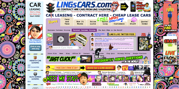
I wish I could that this is Photoshopped and not a real website. There are so many elements on this page that it’s almost impossible to know where to look first or what to do next.
This kind of cluttered design will affect your traffic because visitors will leave your site quickly if they hate your design or if they can’t figure out what you sell or what action they’re supposed to take next.
Not only does a cluttered design drive visitors away but chances they won’t return any time soon. A high bounce rate (the percentage of visitors who leave your site after only viewing one page) can also lead to lower rankings. You surely don’t want that to happen as it can make it more difficult for potential customers to find your site within the search engine results when searching for your business.
How to fix this mistake
“Less is more” is a cliché because it’s true. Here are a few things you can do unclutter your site:
- Challenge every single item on each page on your site. Simply ask yourself: “Does this really need to be here? Does it serve a purpose? Can I live without it?” Remove unnecessary elements, whether it’s an image, a video or an extra call to action that might distract visitors from taking the action you want them to take.
- Differentiate between areas of content, ads and promotions. You want visitors to find what they’re looking for quickly. If you’re trying to get too many elements to grab their attention, none actually will.
- Don’t forget about the importance of whitespace. This refers to areas of your site that are clear of content. The goal of white space is to focus the visitor’s attention to what’s really important, like a buy now button or a registration form that you’d like them fill out. This article has some great information and examples on white space so make sure you read it.
Walls of text
A wall of text is deadly for an interactive experience. It’s boring and it makes it painful to read. Readability and legibility are crucial elements of web design. Your visitors have to be able to read your text so they can understand what your business is about, what you have to offer and how your products and services can help them solve a problem.
Unfortunately, many small businesses get so caught up in overloading the user with information that they overlook how that information is presented. Consider the fact that users don’t read unless absolutely necessary. Instead they scan through the information and pick out points of interest on a web page.
But cramping too many words on a single page isn’t the only problem. There are also other things that can make sure your site text difficult to read and give your visitors a migraine:
- No headings and sub-headings that break up the text
- No bullet points to make the text easier to scan
- Poor contrast between the text colour and background
- Tiny letter size
- Using too many fonts that confuse and tire readers
Here is an example of a page where reading through the text is such a pain:
How to fix this mistake
Fortunately, there some simple things you can quickly implement yourself to improve the users’ reading experience on your website.
Here are the most important ones:
- Break up lengthy pieces of information into digestible blocks of text using headings, sub-headings, bullets, blockquotes and paragraphs.
- Write in short paragraphs
- Use a simple writing style
- Limit yourself to a maximum of three fonts
- Again, don’t forget about white space
- Highlight links, bold important keywords or phrases to provide focus points users.
For more information, read this post that explains the key principles for readable web typography. While this was published in 2009, the same principles apply today.
Not embracing mobile design
With mobile devices now accounting for more than half of the global web usage, having your site optimised for mobile viewing is an absolute necessity. It’s no longer enough to have a website for desktop users. You need to have one that works properly on all phones and tablets as well.
If you don’t, you take the risk of losing tens if not hundreds of potential customers who will go straight to your competitors. Plus, mobile-friendliness has become a ranking factor, which means that a site that isn’t optimised for phones and tablets could find itself slipping down mobile search results. Read more about the importance of having a mobile friendly site and also what you need to do to get your site ready for mobile devices.
Is this really what you want people to see when they land on your site?

How to fix this mistake
With technology now making is so easy to get a mobile-friendly site, you have no excuse for not taking this step. When you build your site with the 123 Reg Website Builder, this is one less thing to worry about as all our templates are responsive. This means that no matter which template you choose to use, your site will look and work great on desktop, tablet and mobile devices. This guarantees that your visitors will have a great experience on your site, regardless of the device they use to access it.
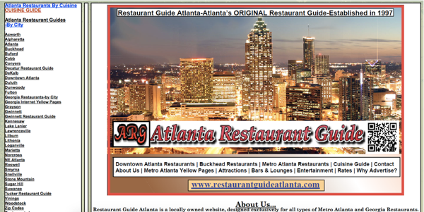
Unclear design with no obvious call to action
How your content is structured is what will make it a success or a failure. If your pages are nothing but endless paragraphs of text or images that aren’t leading the user to take a clear action, you’ll lose them.
All the hard work you’ve put into driving traffic to your site will prove fruitless if your visitors don’t know what they’re supposed to do next. So take a closer look at your site pages and if your call to actions are either buried in a sea of text or just inexistent, like in the example below, then you need a redesign. Like now.

Here’s another example:
Can you really tell what the next step is? I know I can’t.
How to fix this mistake
The best user experience tells visitors where to look and what to do next. This means that you should structure your content so that your visitors know exactly what their next step is and when to take it (ideally, now!). Use your content to present the value of your products or service and always add a compelling and visible call to action telling them what to do next. You can learn more about creating a strong call to action here.
Pop-ups
Pop-ups can be a fantastic tool for generating website conversions and increasing sales. But they can be really intrusive and more often than not they’re poorly designed, annoying, and seem completely irrelevant.
Imagine you click on this interesting article that you want to read or on this product link that you’re interested in buying, and the second you get on the site your screen is covered in pop-ups asking you to create an account, sign up for a newsletter, buy a product, follow them on Twitter, etc. If that’s not bad enough, the button to close the pop-up is so tiny and hidden in the background that you can’t see it. So what do most people do in this type of situation? They just close the tab and move on.
If you don’t like being bombarded by pop-ups the moment you enter a website, your users probably don’t like it either.
How to fix this mistake
Let’s first explain what a good pop-up is.
- It appears when it’s the least disturbing (not the second a visitor lands on your site!)
- It’s relevant to your visitor and the page they are viewing
- It provides a sufficiently attractive offer
- It doesn’t appear too often to a user on the same visit
- It’s not aggressive in language, font size and colour.
Pop-ups can help you to convert your visitors into customers or subscribers but there are ways you can do this gracefully, without annoying or making people mad at your site. If you’re going to use pop-ups, try to be as nonintrusive and as humble as possible.
It also helps to use some fun wording like “we know these things are annoying, but we’d really love it if you’d sign up for your newsletter!”
Confusing navigation
People visit your website to look for specific information, and if they can’t find it, they’ll go elsewhere in seconds. Confusing navigation is one of the main reasons people leave a website.
Why? Because when you have poor navigation, users feel lost and frustrated in the labyrinth, and all they want to do is get out. But they’ll not only bounce, they’ll also leave with the impression that your business is disorganised in more than just your website. These are certainly not the emotions you want visitors to experience when interacting your business.
Here’s an example of poor navigation you should avoid:
How to fix this mistake
A well-designed navigation and internal linking strategy guarantees that all the important areas of your website can be reached quickly and with minimum effort. Think of your site as a map in which any area can be reached from any other area effortlessly.
Make the pages and sections of your site easy and logical for your visitors to find. Also make sure to provide location information so users know where they are on your site and how to proceed to other pages of your site. This can be achieve by using breadcrumbs.
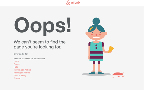
Broken links
Broken links are links that do nothing when clicked or that lead to 404 error pages. They interrupt the user journey and create a bad overall experience on your website so this is something you need to fix quickly.
How to fix this mistake
Make sure you click every single link on your site and that every link works and leads to the page it’s supposed to. Google Webmaster Tools is also a great tool to help with this as it can detect these pages for you. You can find a list with 404 pages on your site in Crawl-> Crawl Errors -> Not Found.
Read our beginner’s guide to link reclamation to learn how to find and fix broken links.
Wrapping up
The bottom line? Keep it simple and usable. Remember that people who visit your site want to be able to find the information they need quickly. Be your own visitor or have your friends and family look at your site and browse through it to see if they encounter any issues that need fixing.
What other design mistakes have you stumbled upon online? Tweet us at @123reg.


