
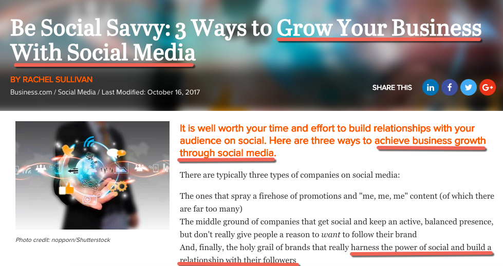
Using the right keywords plays a central role in any site’s visibility in search results. As such, they’re critical for the success of your business success online. Whether it’s a blog post, a product page, a webinar landing page, or your website’s homepage, getting things right with keywords may empower you to dominate the search engine results. In this article, we’ll show you how and where to use keywords in your content so you get the visibility, traffic and leads you need.
When you understand your keywords and how to incorporate them into your content can significantly increase your chances of getting your web content noticed. And you want to be on the first page of search results — because 95% of people only look at that first page. And you want to be at the top, because half of clicks go to the first three results.
Understanding keywords and SEO
Before we go any further, let’s make sure we’re on the same page about keywords and search engine optimisation.
SEO refers to optimising a web page to get it to rank higher in the search engine results pages (SERPs). While there are many steps and factors that go into the optimisation process, proper use of keywords is an important one.
Keywords are words and phrases that describe what the content on a page is about.
So when you use keywords to optimise your content, Google will then use that information to determine which content is relevant to a particular search term and how the page should rank in searches for that term.
Keyword research
The first step is to do a keyword research. That’s how you find the words and phrases that your prospects are using online to search for whatever it is you’re offering.
Don’t ever skip this step as you might end up optimising your content for keywords that your audience isn’t actually using to search online. Or you could end up attracting the wrong crowd that isn’t interested in your offer.
Keyword research helps you to put together a list of terms that your audience is using to find your business, products and services online. And it also helps you to come up with a content strategy as you get to create content around the terms that you know your prospects are searching for online.
There are lots of free and paid tools that you can use to find relevant keywords to use in your content, so there’s sure to be one that’s right for you.
In this beginner’s guide to keyword research you can learn everything about the importance of keyword research, the types of keywords you should target and the tools you can use to find the right keywords to use in your content.
Find existing content that needs to be optimised
Keyword research isn’t just useful for creating new content. You can also use it to improve your existing content and boost its visibility in the search results.
But how do you know which pages could use some SEO sprucing up? This is where Google Analytics (GA) comes in.
Hopefully you’re already using GA, but if you’re not, then we’d recommend taking our free Google Analytics course as soon as possible. By the end of the course, you’ll learn how to use this powerful tool and where to find the most important insights into your visitors’ behaviour on your site.
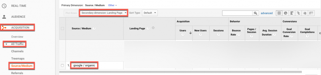
If you’re already using GA, then go to your account and click on Acquisition » All Traffic » Source/Medium. Next, click on google/organic to find those pages on your site that are bringing in the most organic traffic.
You can then add Landing page as a secondary dimension to see the list sorted by landing page.
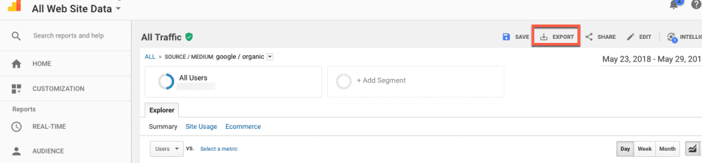
Make sure you’re checking the data for a timespan of at least one year.
Export the list and start improving each page.
Next we’ll show you how to optimise any new or existing page using your properly researched keywords.
Where to use keywords to optimise your content
Search engines use algorithms to work out the relevance of a webpage to a particular search query. The location of keywords on a page can influence how the search engine interprets the content.
Here are the places where your keywords should be found:
Page title
The title is one of the most important elements on a page. Not only does it tell users and Google what that page is about but it’s also the first thing people see in the search results.
So make it enticing enough so people feel compelled to click to learn more. But also include a relevant keyword or phrase as this will help search engines understand what the page is about, and also encourage users to click through to your website. Avoid including the same keyword multiple times (keyword stuffing) as it won’t help your rankings and could even damage them.
For blog posts: The title will usually be the title of the article, which is why it’s important to write a good title. This guide includes tools to help you write better blog post titles.
So, when you write your page title, make sure you:
• Have a unique title for each page
• Include the name of your product or the main topic you’re covering on the page
• Keep your title between 42 and 60 characters, including spaces. This is just an estimate because it’s no longer about the number of characters but about the number of pixels the characters occupy. (Although Google regularly changes the number of pixels it displays.) To make sure your title isn’t cut off, try not to go over 60 characters, but you may find you need to experiment with title length before you find one that Google displays fully.
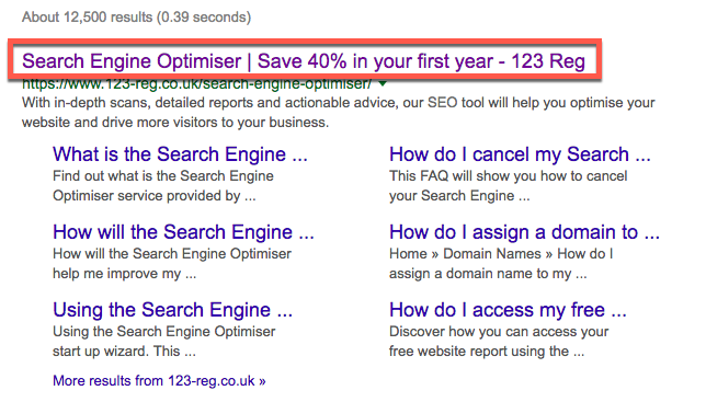
Meta description
This also shows up in the search results, below the title, so you know it’s important. But not because it’ll help you to rank higher, which it won’t since it’s no longer a direct ranking factor, but because it can help Google to determine how relevant your content is to users’ search queries.
In addition, the meta description can have an impact on whether users decide to click through or not to your page.
Check out these examples:
So, since the meta description should summarise the content on a page, it makes perfect sense to also have it include keywords that are relevant to that content.
You can find lots more useful tips and examples in this guide to writing title tags and meta descriptions that get clicks.
Headings and subheadings
Headings and subheadings are useful at breaking up the content, thus making it easier for readers to scan it. They also help to describe each section of content.
In HTML, coding the header tags from h1 to h6 form a hierarchy.
The coding should be something like this:
<h1>Main Heading</h1>
<h2>Secondary Heading 1</h2>
<h3>Sub-section of the secondary heading 1</h3>
<h2>Secondary Heading 2</h2>
<h3>Sub-section of the secondary heading 2</h3>
Make sure to also include relevant keywords in a few headings and subheadings as well. This should happen naturally, especially if the topic you’ve chosen was based on keyword research.
Don’t force keywords into headings, only include them if it sounds natural and helps the reader understand what the next section of a page is about.
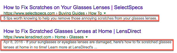
Content
Content is one of the top SEO ranking factors. Quality, informative, entertaining content that is able to answer a searcher’s query, that is.
To optimise your content for search engines, you need to use keywords the right way. This means using your main keyword and variations of it throughout the content – in the first paragraph and then wherever it makes sense.
Here are a few examples:
As you can see, the keywords revolve around the main topic.
The idea isn’t to use the exact same keyword in every paragraph – that’s keyword stuffing and it can harm your site and get you penalised. It’s to write for your audience and provide answers and valuable information they’ll find useful.
Images
Images are such a fantastic opportunity to add relevant keywords to your content. Since search engine bots can’t see images, you can help by adding a descriptive alt tag to each image you include on your site or blog.
The alt tag is a short description of an image and it’s a great place to use your keywords. Why? Because it’s another piece of content that Google can index so it also creates an extra way for your audience to find your content on the image search results.
For example, here’s what shows up in the image search results when running a search for “emergency plumber london”.
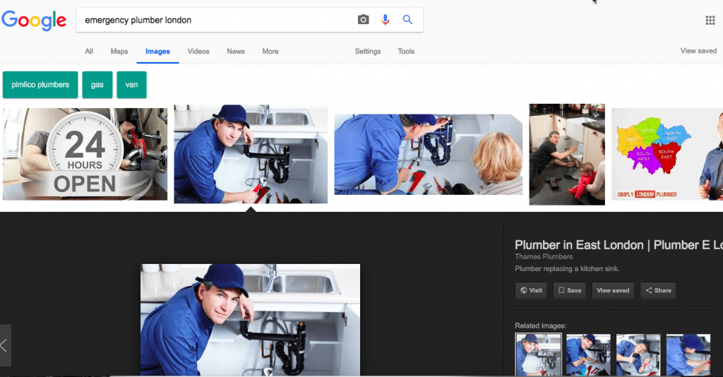
When adding the alt tag, make sure the text is a description of the image. For example, you shouldn’t label an image of a cat with the alt text “emergency plumber in London” as it’s in no way relevant.
Check out this simple guide to learn the steps to follow to properly optimise images for search engines.
URLs
URLs are another place where you can add your keywords and summarise what a page is about. In fact, the best URLs give users (and Google) an idea about the information that can be found on that page even before they visit it.
To keep your URLs short, remove stop words such as “a”, “and”, “the” and so on.
You should also remove any special characters like punctuation marks, hashtags, currency signs as these will make the URL “ugly” and encoding will artificially increase the length of the URL
Here’s an example:
Anchor texts
Anchor texts, meaning the clickable text that’s highlighted as a link, is yet another great place to add your keywords.
Like with keywords, make sure you vary the anchor texts you use to get the most SEO value out of them.
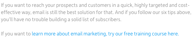
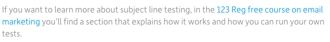
Here are three examples of anchor texts that all link to our free course on email marketing:
#1
#2
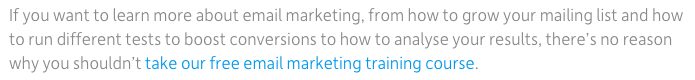
As you can see, the keyword is present in the anchor text but we used variations of it to avoid repetition.
The anchor text also acts as a call to action, telling people what to do next, and what they can expect if they click on a link.
Wrapping up
Now that you know how and where to use keywords to properly optimise your content for search engines, it’s time to start improving your site.
Want to learn more about SEO and how to ensure your site is properly optimised for search engines? Our free course on search engine optimisation covers everything you need to know on the topic.


