
Bloggers, entrepreneurs and businesses live and die by their email subscribers. No wonder there are so many great articles out there offering advice on how to generate more leads and increase email open rates.
But what if you’re a small business and don’t have the time or resources to implement a complex list-building strategy? And what if you’re not tech-savvy?
This post is for the Average Joe and Jane who are often left out in the cold. It’s for those time-deprived small business owners and entrepreneurs with day jobs. It’s for those who are juggling thirty tasks at once. It’s for anyone who needs easy to implement email list building strategies.
Read on to learn some simple, non-technical yet effective strategies that you can use to entice more visitors to sign up to your mailing list, from keeping your forms short and simple to experimenting with call-to-action colours and copy. Put them into action and you’ll increase your chances of turning visitors into subscribers.
Ready? Let’s get started…
Stop asking for too much information
You should not only make it extremely easy for people to sign up for your mailing list but you should also make your opt-in forms really simple.
If aside from name and email address you’re asking for additional information such as phone number, location or birthday, let me ask you a question… Do you actually need that other information? Do you use it for anything?
If the answer is “no”, then you need to stop asking people to provide it in your form. There are many A/B tests that confirm that the bigger the form and the more details you ask from people, the less likely they are to sign up. For example, in this case study, Marketing Experiments ran an A/B test where they cut down form fields from 20 to four. Predictably, they saw an increase in leads – an 188.46% increase, to be precise.
So what should you do? Keep it simple. Stick to the absolute bare-minimum required information and only ask for what you really need and know you will use. Don’t need phone numbers? Don’t ask people to provide them.
Here is a simple example from A Beautiful Mess, a women’s lifestyle company that also created a photo editing app, where they only ask for one thing: an email address.
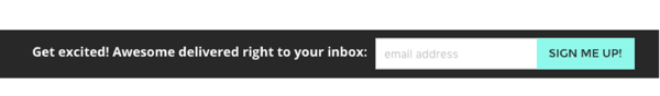
So the key here is to lower the barrier to entry as much as possible. You don’t want visitors to take too much time to sign up because every additional field is an extra five seconds out of their precious time and also an opportunity to change their minds.
Tell them what they gain by signing up
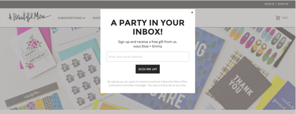
If you want visitors to subscribe, you need to give them the feeling that by doing so they are entering an exclusive club that will get them special treats and offers. These can come in the form of valuable information no one else is sharing, discounts, invitations to events and anything else you can think of that might interest them. Make sure to mention these perks when you try to attract potential subscribers.
Here is an example from A Beautiful Mess:
Tell them what they lose if they don’t
This strategy capitalises on an emotional trigger called “loss aversion”, which focuses on the fact that the pain of losing something is stronger than the happiness of gaining something. In other words, people don’t want to feel like they’re missing out on something so by telling them about the things they’ll be missing if they don’t sign up, you can get more visitors to become subscribers.
Add a sign up button to your Facebook page
In December 2014 Facebook added a new feature so businesses could add a call-to-action button to their page, which can redirect visitors to a page on or off Facebook. The only downside to this is that you can’t customise the text for the calls-to-action so you are limited to the options they provide, which are:
- Book Now
- Contact Us
- Use App
- Play Game
- Shop Now
- Sign Up
- Watch Video
“Sign up” is the only one you need and it’s perfect for getting subscribers to sign up for your mailing list. Here it is in action:
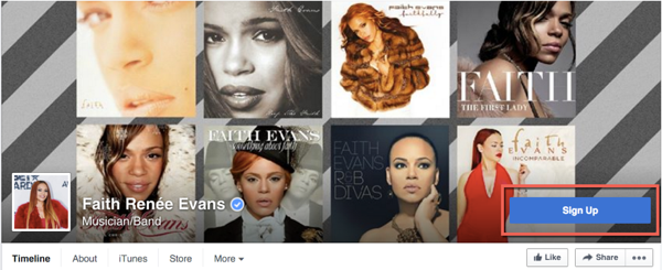
So how you do go about adding a Sign up button to your Facebook page? It’s very simple:
- Go to your Page’s cover photo and click Create Call to Action.
- Choose your call-to-action, and enter the URL for your Subscribe page.
- Click Create.
That’s it.
Experiment with colour and copy
What colour is your sign up button? Are you using generic copy such as “Sign up” or “Subscribe” for your opt-in buttons?
If you answered “why does it matter?”, you’re missing out on a very simple way to increase your mailing list. Here’s why:
- Conversion consultant Jeremy Smith says that the copy on your call-to-action button matters most when it comes to turning visitors into paying customers.
- 85% of shoppers say that colour is the main reason for why they choose certain product over another.
Take a look at this infographic on the psychology of colour and how it affects buying decisions. Try different versions of copy and colour for your call-to-action buttons and see what works best for you.
You can also check out the following resources:
- Creating the strongest possible call-to-action to find out what are the six key elements of a powerful call-to-action
- Six A/B tests to skyrocket your sales for some ideas on the different calls-to-action you can experiment with
- Six proven ways to boost the conversion rates of your call-to-action buttons to learn how to personalise the text so it becomes more appealing to the visitor.
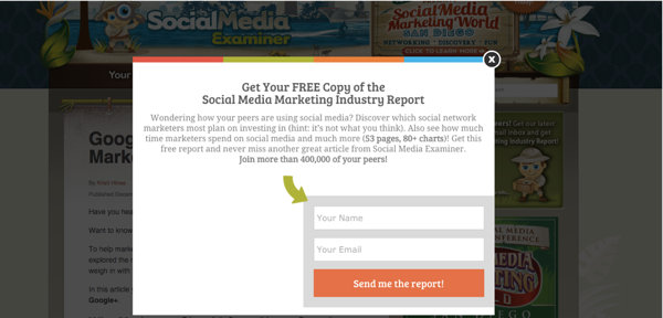
Add exit-intent popups
Did you know that 70% – 96% of the visitors abandoning your site will never return? A simple way to convert many of these abandoning users into subscribers is by using an exit-intent popup. This technology detects user behavior and prompts them with a subscribe form just when they’re about to leave the website.
Michael Stelzner, CEO/Founder of Social Media Examiner, attributes 70% of their email subscriptions to their popup form. He specifically notes in the study that, “Without it, the list would be much smaller.”
Here’s an example of a popup they currently use:
Show off testimonials
Adding testimonials on your sign up page is an effective way to build visitors’ trust and to show them that you’re the real deal. Users won’t give away their information to anyone. But if you show them that other people trust and appreciate you, then you’ll have an easier time turning them into subscribers.
Check out this example from CopyHackers:
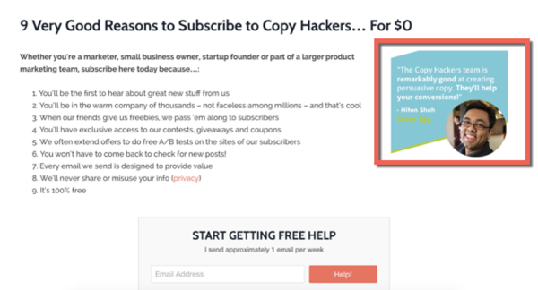
So find one or two great testimonials, whether they’re mentions on social media, emails with feedback or reviews from customers, and add them to your sign up page (but make sure to get permission first).
Add sign-up messages at the end of your blog posts
Readers who reach the end of your blog post are primed. Your headline grabbed their attention. Your intro drew them in and your content kept them on the edge of their seats. Out of the thousands of blog posts they could have read, they chose yours. And they read it until the very end. That means they like you. They really, really like you.
The end of a blog post makes the perfect place to ask them to join your mailing list if they want to get more of that amazing content.
So don’t be afraid to strike while the iron is hot. Social Media Examiner has their sign-up form just below the article and above the comments section:
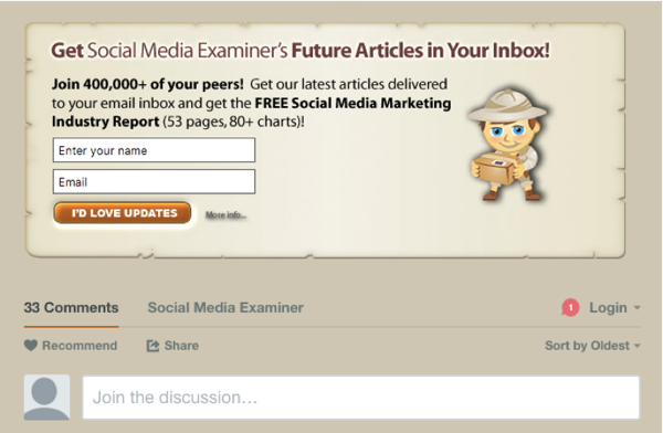
Remember that those readers who read your articles entirely are interested, focused, engaged and looking for more. So make sure to let them know where and how they can get more.
Wrapping up
If you’re looking for your ideal customers and subscribers, they’re all out there… ready to join your mailing list, ready to read your awesome content and ready to preach your virtues to their friends and followers. You just need to make it as easy as possible for them to get that content and everything else you have to offer.
Have you used any of these tips and if so, have they helped you get more subscribers? Do you have any other good strategies to turn visitors into subscribers?

