
You may be pumping time and resources into building a nice looking site and filling it with clear information about your business to attract more customers. But are you paying enough attention to your contact form? Although it’s a hot spot for turning visitors into leads for any business, contact forms are often neglected.
Don’t underestimate how useful contact forms can be. They’re actually vital for interacting with visitors and for giving them a quick and easy way to get in touch with you. While you may have several interaction points and forms on your site (from creating an account, signing up for a free trial to downloading a useful resource), the contact form is where users come to connect directly with you. In other words, having a contact form on your site can mean big things for your business.
In this post we’ll explain what makes a solid contact form, how and where to add a contact form to your site, and how to optimise it so potential customers are more likely to fill in your contact form. After all, you probably want to get leads, inquiries and love notes from your adoring fans and customers, right?
Why are contact forms so important?
Contact forms are hands down the best communication tool at your disposal. Why? Because a contact forms serves as a gateway for every type of visitors that lands on your site – from customers and potential customers to press, salespeople, job seekers and more.
Here are a few reasons why contact forms are so important and how they can change the way you do business and communicate with potential customers:
Easy way for customers to reach out. Having a way to let your customers get in touch is critical to your business success. Your visitors can be semi-interested, confused or hesitant about your business, services or products. A contact form makes it easy for them to ask questions, to ask for help or for a quote. It can also help you improve your products and services by providing an avenue for valuable feedback.
Generate leads. When someone visits your website, they’re an anonymous visitor. A contact form is essential to converting them into more than that. The fact that they’re willing to share their personal information with you indicates that they’re prepared to enter into some kind of relationship with you that may well result in some business for you – which is exactly what you want.
Learn more about who your customers are. With a contact form (and Google Analytics) you can track enquiries and learn more about who your visitors are. You can find out where they came from (Google, social networks, other sites) and went to before and after submitting your form, as well as which pages they visited between arriving and completing the contact form. In a marketplace that’s increasingly data driven, this type of information is extremely powerful.
No interruptions. You can place a contact form anywhere on your site, and a visitor can fill it in and submit it without being interrupted. In comparison, adding an email address that a user needs to click on in order to contact you pulls their attention into another window to send the email. If you want to keep users on your website, that’s not doing you any favours! Make sure you offer simple and convenient access for your users via contact forms.
With all that is riding on your contact form, don’t you think it’s worth spending the time to make it an experience that works?
If your answer is “yes”, read on to see how you can add contact forms to your sites.
How to add contact forms to your website
Let’s look at what your options are for adding contact forms to your site.
If you have a WordPress website…
Setting up a contact form in WordPress is easy, even if you don’t know any code and you’re an absolute beginner. All you need is a plugin, and thankfully, there are plenty of options to choose from.
Here are a few contact form plugins that you can use for your WordPress site:
- Contact Form 7 – This is one of the most downloaded, popular and flexible free contact form plugins. With over 38 million downloads on WordPress.org, Contact Form 7 is one of the most used WordPress plugins. It provides a user friendly interface, supports Ajax powered submission, CAPTCHA and Akismet spam filtering.
- Ninja Forms is another popular plugin to create contact forms. With drag and drop features, you can very easily create contact forms, email address collection and any other type of form within minutes. With Ninja Forms, all the magic happens within a drag-and-drop interface in your WordPress dashboard.
- Fast Secure Contact Form is another widely used forms plugin. You can use it to easily create a contact form but a great feature you can take advantage of is redirecting visitors to a specific URL after they’ve submitted their form.
These are just a few options and any one of them is perfect for creating simple contact forms for your WordPress site. If the above suggestions don’t suit your needs and are looking for plugins with more complex features you can always go with popular paid options like Gravity Forms or Formidable.
If you’re using the 123 Reg Website Builder…
If you’ve built your site using our 123 Reg Website Builder, adding contact forms to your site is a breeze. Log into your account, create and customise your contact form and then simply drag and drop it onto your website anywhere you like. This tutorial explains exactly how to add a contact form to a site built with the 123 Reg Website Builder.
If you have a self-coded site…
Of course, if you have the skills or the resources you can always create your own contact form so it looks exactly like you want it to. Contact forms can be built with various scripting languages, but the most popular are PHP contact forms.
Other options
Email marketing tools usually offer a form building option as well.
Where is it best to place a contact form?
You’ve built the perfect form. Now where should you place it? Will more people see it on the Contact page or About page? Should you place it on other pages as well, and if so where exactly?
Decisions, decisions.
Of course, the first and most obvious place to add you contact form is on dedicated Contact and About pages. However, these aren’t the only pages where it makes sense to add one.
Depending on your business and what you’re selling, you can add a contact form on your homepage, on your Portfolio page, on your Services page and on every other page on your site where it may be relevant.
For instance, if you’re a plumber, a wedding photographer or a food coach, it’s vital you have a contact form, or a button that sends visitors to a contact form.
Check out this example:
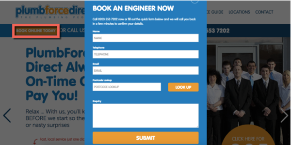
In this case they’ve chosen to place a “Book online today” button at the top of the homepage which opens a contact form when clicked. This is a good option if you already have a lot of content on your homepage and want to save up some space.
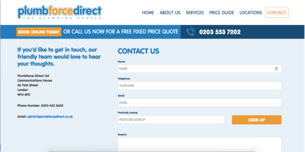
They also provide another contact form on a separate Contact page:
Here are some other high-converting places where you can add a contact form:
1. On your blog
If someone reads your blog post all the way to the end, they’re hooked. Ending your interesting how-to blog posts with a contact form is a great opportunity to capture new leads.
2. On your homepage
Users look in the header and in the footer for contact information and social buttons. So why not take advantage and add a contact form in the footer, if you have the space? If not, then highlight the Contact page in your menu.
3. On top performing pages
Go to your Google Analytics account. Now look under Behaviour -> Site Content -> All Pages. In this page report, you can quickly get a feel for what your top pages are that are bringing in the most traffic from search engines. This is also where you should be placing your contact form. Add it to the top in a hard-to-miss featured box and don’t forget to highlight why users should fill it in.
But where exactly should you place the contact form on a page?
Many say that the best converting spot lies in the upper right hand corner of the page because that’s where people tend to look first. Placing it at the top of the page, also known as above the fold, makes the form visible at first glance without scrolling.
But that’s not always the case. Various studies show that many users scroll on a page even before the page has finished loading.
According to Amy Schade of the Nielsen Norman Group:
“The fold still exists and still applies… But more than a measurement, the fold is a concept… Users do scroll, but only if what’s above the fold is promising enough…anything that’s hidden and that the user must uncover will only be seen if the user deems it worth the hassle.”
So for users to scroll you need to optimise your page for lead generation. That means telling a story first and then, when they are convinced that your products or services are what they want and need, asking them to fill out a contact form.
Think about it this way: where you place your contact forms depends on your business and the industry you’re in.
Are you a food coach? Placing your form above the fold can be premature. In this case you should first explain what you do and then ask visitors to get in touch.
As a rule of thumb, you should place your contact form below the fold if your product or service:
- Is expensive
- Is complex and needs to be explained more clearly
- Requires a high commitment
The best thing you can do is to test different options, both above and below the fold, and see which ones work best for your website.
What makes a good contact form?
Every site owner wants to create contact forms that convert into leads and enquiries but how do you do it? Let’s look at a few things you can do to increase the chances of visitors filling in your contact forms:
Form length matters. If you want more visitors filling in your form, consider reducing the number of fields. If the form is too long, users will stop and evaluate whether it’s worth their time to complete all of those fields, or they might just not be willing or comfortable sharing too much personal information with you.
Take this contact form of a wedding photographer:
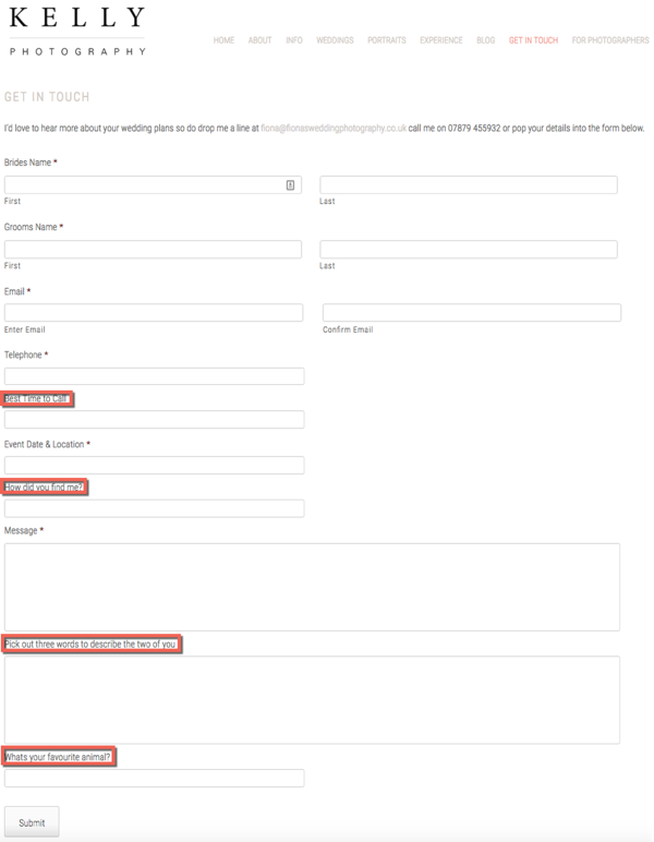
Does this photographer really need to know three words that describe the bride and the groom at this point? Or their favourite animal? Not really.
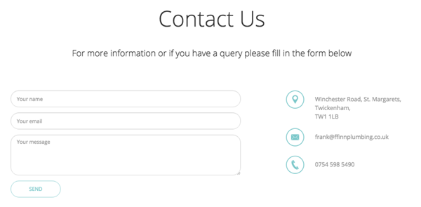
So do try to keep your forms short and sweet, and only ask for the information you really need like name, email address, phone number and a text box where they can write their message.
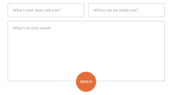
Here’s a good example:
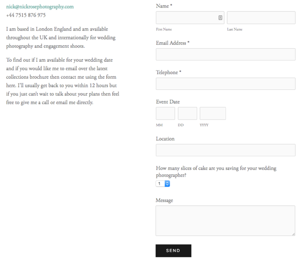
I like how there is one question that adds humour to the contact form, also showing a bit of the photographer’s fun personality.
So, if you take away one thing from this post, let it be that removing unnecessary form fields can significantly increase the chances of visitors filling in your contact forms. Look at your contact form and decide what must stay and what can go. Do you really need to know people’s favourite animal? Or will a contact form like the below do?
Don’t ask for overly sensitive information like exact address and ZIP code, parents’ names, etc. This can create anxiety and drive visitors away. You can collect this type of information later in the process, when you’ve built some trust with that visitor.
“Required” isn’t required. You won’t gain anything by labelling certain fields as “required”. Instead you could label certain fields like location as “optional”. But this takes us to point one of removing unnecessary fields altogether. If you don’t need certain information, don’t ask for it.
Provide help along the way. If your contact form is a bit more complicated and you require more information than most, make sure to help users fill it in. Add some text inside or below the fields or tooltips next to each field to guide them.
Ensure you have a strong call-to-action. While most contact forms use the word “Submit” for their call-to-action, try to be a bit more creative with your wording. Why not go with “Send your message”, “Send it” or “Let’s get working” or “Let’s get your AC fixed”. Also, don’t be afraid to super-size your call-to-action button.
The surrounding space. Make sure the page you’re placing the contact form on is clean. Avoid adding clutter, other calls-to-action and any other elements that can distract the user’s attention from filling in the form.
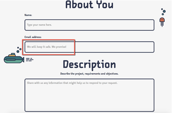
Tell them their data is safe with you. We are all reluctant to give away personal information, especially online. The best way to reassure prospects that their information is safe in your hands is to link to your privacy policy just below the form or as a footnote. You could also inform them that they their email addresses won’t be shared, sold or added to any marketing lists.
Here’s a good example:
Think mobile. With the mobile audience growing ridiculously fast, it’s imperative to make your contact forms mobile-friendly. Test and make sure your contact forms work on all mobile devices.
Make sure your forms work. We know this is obvious but do test your contact form to ensure it works. Having links that are broken or won’t send properly is just bad for business. If your contact forms don’t work, how can people communicate with you? That kind of defeats the purpose of the contact form.
Remember that your visitors are all different. This means they might have different preferences for getting in touch with you. Some might prefer calling while other would rather engage with you on social media. Make sure your contact section offers various channels for your visitors to communicate with you.
Wrapping up
The layout, the number of fields, the call-to-action all have an impact on how many of your visitors actually fill in your form. Reduce friction and you’ll notice that communication and conversion will both improve.
What other things are you doing to improve your contact form conversion rate?


