
So you want a new website. It could be you’re just starting out in business. Perhaps you have an existing company you want to get online. Perhaps you’ve had the same old, tired website for the last ten years.
Whatever your situation, you’ll undoubtedly want a website that looks good on everything from a desktop computer to a smartphone.
And wouldn’t it be nice if you could build the website yourself and update it whenever you wanted to.
After all, that would take away the hassle of finding a good web designer, and the cost of having them build and update your site.
In the past, going it alone on your website would have meant spending hours learning to code and then building it from scratch – a project that would have consumed huge chunks of your time that you could have spent on growing your business.
Now you can build a quality website that looks great on any device in less time than it takes to do a big shop.
With Website Builder from 123 Reg, you can have a new site up and running in no time at all. It’ll look great on any device, you can update it whenever you want and if you have an existing website, it’s easy to transfer the content across to the new site.
So what can you expect from Website Builder? Well, here are five different kinds of site you can build today.
Consulting
Launching your own consultancy business is a great way to go it alone if you’ve got substantial experience in a certain field.
But if you don’t give the right impression, you’ll find it hard to pick up work. As you can see, Website Builder makes it easy for you to look your best.
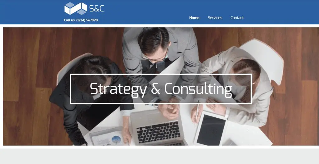
You can see a preview of the Consulting template here. If you like it, you can use it to build your own site straight away.
Handyman
The home repairs sector is as competitive as any, and for that reason you need a website that lets you make a connection with potential customers.
If you opt for the Handyman template, you’ll be able to showcase your skills and offer customers a tempting discount.
People will be able to contact you at the click of a button, so if someone wants a quote they’ll be able to let you know quickly and easy.
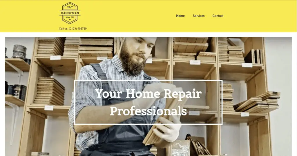
Check out the preview of the Handyman template here, and then use it to create your own ideal website.
Portfolio
Photographers and artists always need to have their best work on display, and the Portfolio template lets you do exactly that.
You can group your work by category, and let site visitors know about your passion.
There’s also a contact page, so people can get in touch if they want to commission you.
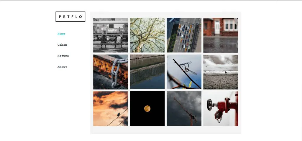
Think Portfolio is the perfect website for you? You can see a preview here and start creating your site right away.
Non-Profit Foundation
Not every business has to exist to make money. If you’re running a non-profit organisation, you need to make sure all the right people know what you’re doing and why.
That’s where the Non-Profit Foundation template comes in. It lets you tell website visitors all about your cause, why they should support you and what they can do to help.
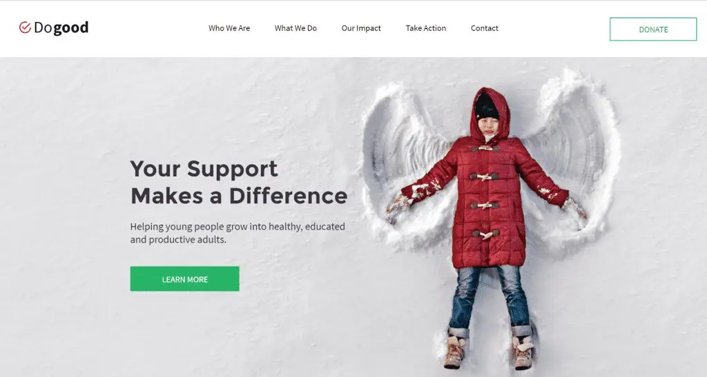
Does that sound like the ideal template for you? You can see it in action here.
Italiano
Want a website that lets you demonstrate the character of your Italian restaurant to potential diners? Then Italiano is right up your street.
You can showcase your menu, and let people know where you are. There’s also a gallery so you can give people a little taste of what you have in store for them before they set foot in your restaurant.
Want to get to grips with the Italiano template? You can start using it here.
You can also view our other restaurant templates here.
Summing up
These days, a great business needs a great website. Website Builder from 123 Reg lets you take control of your online presence, allowing you to make a real connection with potential customers and clients far and wide. Website Builder really does offer something for everyone, and if you didn’t see a template you like in this post, you can view the full range here.


