
You may have a beautifully designed landing page that’s getting heaps of visitors. But if it’s not making you money, you must be doing something wrong, right?
It can often be a struggle to figure out what’s missing or is wrong with a landing page that underperforms. Thankfully, there are a few common mistakes that many businesses can avoid – pitfalls that might be sabotaging your results and driving down sales. Start profiting by honing in on these five landing page mistakes.
But first…
What is a landing page?
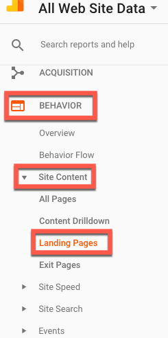
If a user arrives on a page from an external source – whether it’s Google, Facebook or another website – then that page is that visitor’s landing page. If you want to find out which pages on your site visitors are landing on, go to your Google Analytics account and click Behaviour > Site Content > Landing Pages.
If you’re not yet using Google Analytics, we recommend you install it as soon as possible. Also, take the free Understanding Your Visitors module of 123 Reg’s Online Business Training so you learn more about how to use it and what every piece of data tells you about visitors’ behaviour on your website.
Mistake #1. Slow page speed
You may not think about slow page speed as being critical to a landing page’s success but it is. In fact, if a page fails to load within five seconds, 74% of visitors will leave the site.
Page speed is so important that top brands make it their mission to have their pages load in less than a second.
So, as you can see, it doesn’t matter how fantastic your product or service is, or how attractive your landing page is if people don’t stick around long enough to see it.
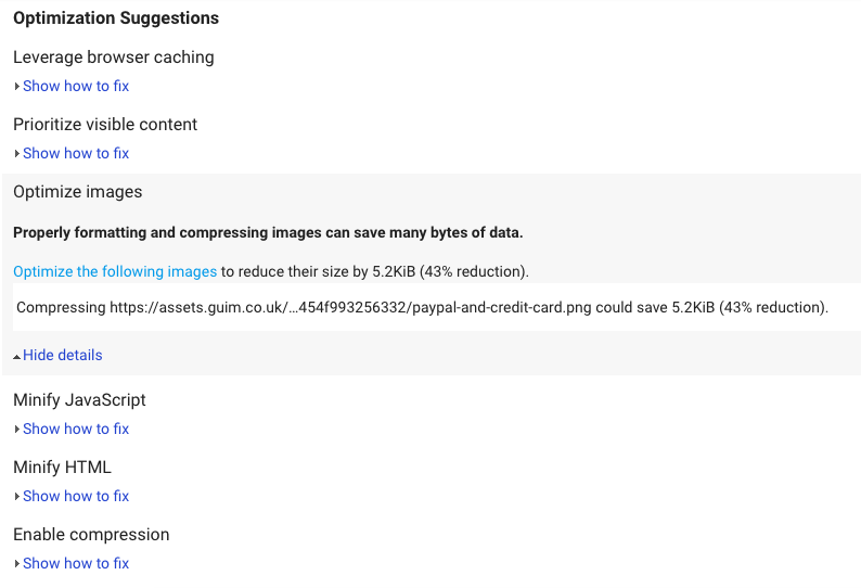
Don’t know how to test your page’s speed? With tools like Pingdom or Google’s PageSpeed Insights you can do a quick check to see how long it takes your pages to load on desktop and mobile.
You’ll also get some recommendations to improve your speed, like which images may need to be optimised.
The best thing is, you can send these steps straight to your web designer, who will be able to implement them for you.
Alternatively, you could create a new site with the lightning-fast 123 Reg Website Builder.
The following resources explain why page speed is so important and ways to improve it:
- How to speed up your WordPress site
- How to optimise images to reduce load time
- Why your slow website is losing you customers (and how to fix it)
Mistake #2. Cluttered design
A landing page is a page designed with a specific goal in mind. Or it should be.
In reality, most landing pages are cluttered and ask visitors to do a variety of things – sign up for a newsletter, buy a product, fill out a contact form, connect on social media. And what happens when there are too many options? Users leave taking no action.
The same happens when there’s no obvious action to take.
But when a landing page is focused on a single action, visitors don’t have to think about the next step they need to take. That step is obvious.
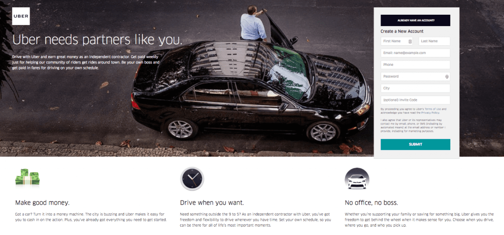
Just like in this example from Uber:
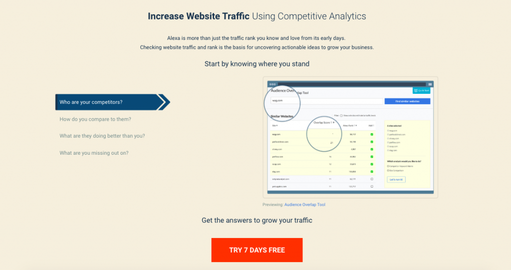
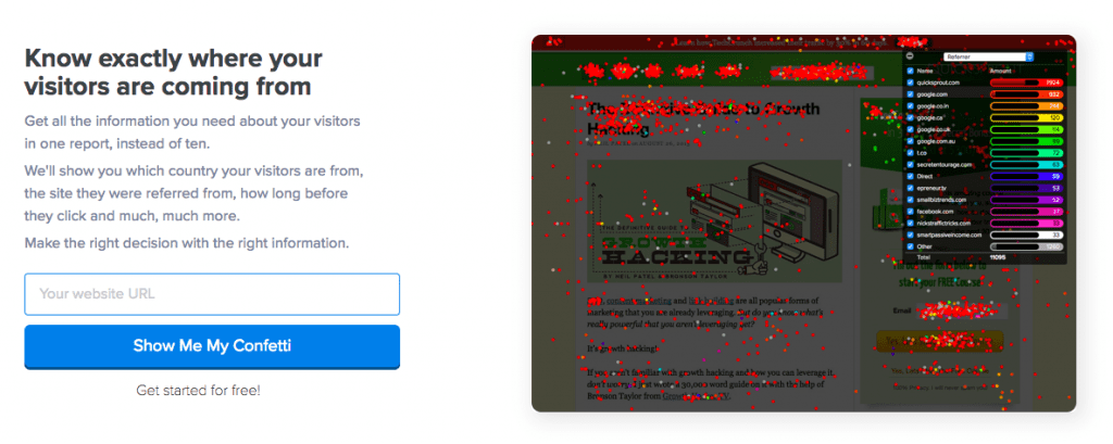
Or this one from Alexa:
Or this one from Staunch & Flow:
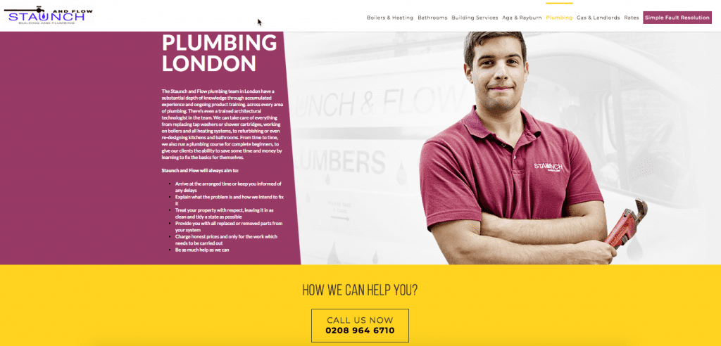
What do these examples have in common? They’re clean, clutter-free and laser-focused on one action, thus making sure visitors know exactly what the next step is.
This infographic from Kissmetrics summarises the key elements of a winning landing page: the headline, the hero image, the benefits, the social proof and the call-to-action.
So review your landing page to make sure it’s simple, clean, distraction-free and designed around a single action that you’d like visitors to take.
Mistake #3. Boring headlines
The headline is the first thing people see when they land on your page. If it’s vague, generic, doesn’t tell a story or clearly communicate what the page is about, then it won’t make much of a first impression. And it won’t entice people to scroll down the page to learn more about your offer and finally buy.
To create a strong first impression:
- Make the headline point out to the desired result or a benefit
- Make the supporting text below very briefly explain how it works or how users will get that result that you mentioned in the title.
Let’s take a few examples so you get a better understanding of what makes a good headline.
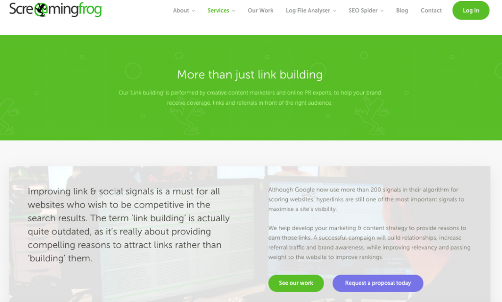
Does Screamingfrog’s headline clearly communicate what they can do for their prospects or what problem their service can solve? Not really. Sure, the service they’re offering is “link building” but link building is a service, not a benefit.
Another issue with this landing page is the use of marketing language. It’s probably not how their customers speak, which is why there might be a lack a connection. Do their prospects want “more than just link building” or do they want more people to find their businesses at the top of Google’s search results?
Here’s what you need to remember: a landing page needs to tell a story. And that story needs to be about the potential customer (not you) and what they’ll achieve or what problem they’ll solve by buying that product or service.
A great headline helps to build the story. It’s a promise that draws the prospect in and makes them want to learn more about the offering and finally buy. Think of it as the top benefit of using your product or service.
Here’s another example:

Would “keep your home warm and dry at all times” as a headline motivate you more to keep reading, considering that’s the promise or benefit of the service they’re offering?
Now here’s a fantastic example from Copy Hackers:
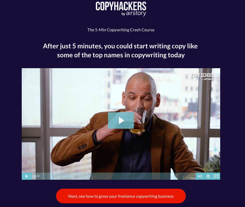
You get the benefits right from the headline.
Want better headlines for your landing pages? The following resources include some excellent formulas and templates that you can use to create powerful headlines for your landing pages:
- 7 proven headline formulas that convert (and why they work)
- 51 headline formulas to skyrocket conversions
- 5 proven formulas for high-converting landing page headlines
Mistake #4. Generic or stock visuals
Using stock photos on your landing pages is one the biggest mistakes you can make and one that can cost you sales.
Instead, using people in real photos could increase your sales by 35%.
So, for best results, the visuals on your landing pages should:
- Show off your product or service in use
- Give people a better understanding of how the product works and what they can achieve with it
- Highlight the results so your prospects can picture themselves using it
Here’s a good example from CrazyEgg where they show their product in action, and what you’re getting if you buy it:
Even if you have a landing page where visitors come to download a resource or sign up for a webinar, you should still use a relevant image so they know what they’re going to get.
Here’s a good example from Copy Hackers:
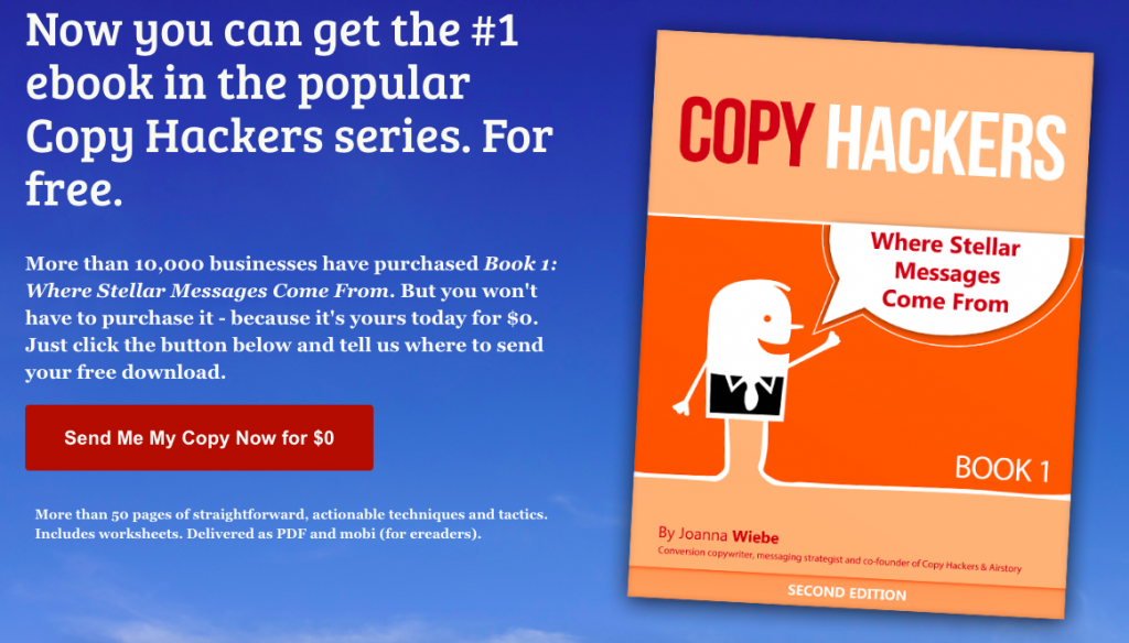
This ebook landing page uses a simple illustration to show people what they’ll receive after they click the button and submit their information. This is important as it increases the perceived value by boosting credibility.
Mistake #5. Generic calls-to-action
Even if you get everything right on your landing page, if your call-to-action (CTA) isn’t powerful and positioned correctly on the page, you might still miss your chance to turn visitors into customers.
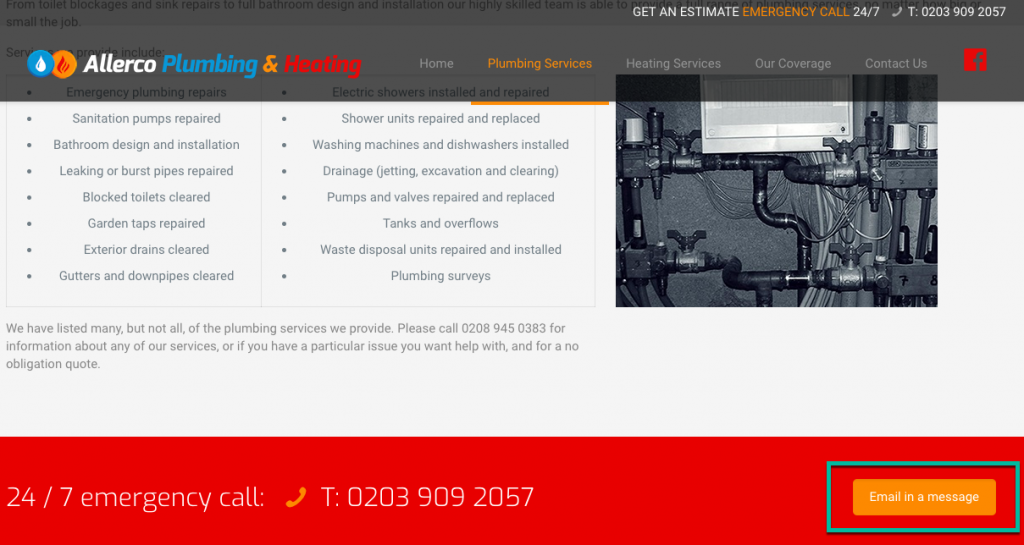
For example, this CTA, while visible on the page, is confusing:
To get visitors to take that next step, your CTA needs to be relevant, specific and easy to spot.
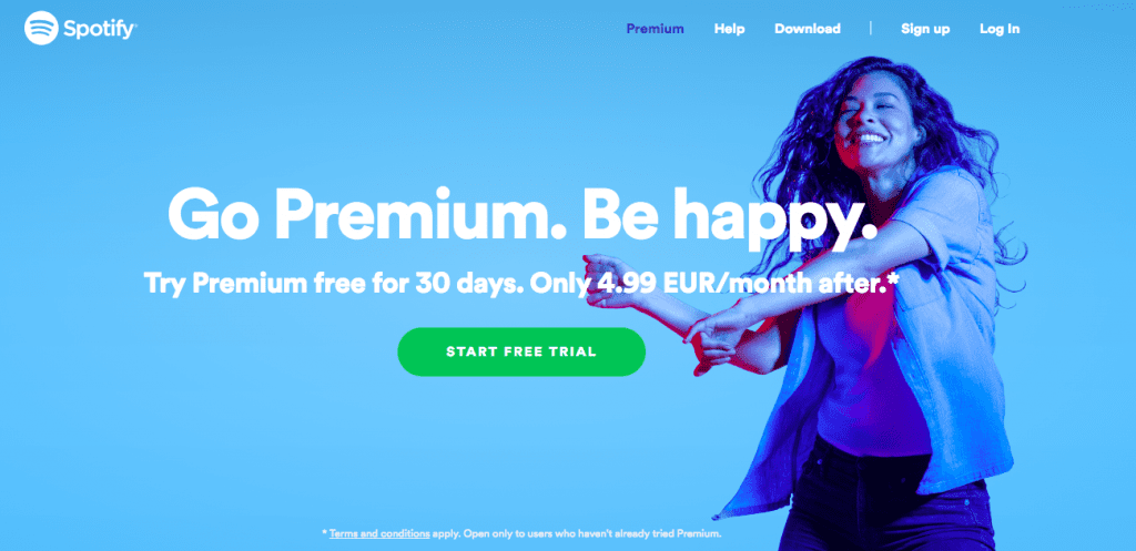
Check out these examples from Spotify and CrazyEgg to see what makes a good CTA in terms of placement and copy:
Read more about why calls-to-action are the most important words on a page and how to create a powerful CTA.
Wrapping up
These are some of the most common landing page mistakes that are preventing visitors from taking that next step and buying from you. But while they’re easy to make, they’re also easy to fix. So if a landing page isn’t making you money, make sure you go through this list and see what you can fix to turn more visitors into customers.


