Every year, new elements and styles pop up in website design. Some elements help tell your story in a more appealing way, others work to improve how content looks on a specific device. While these are all great and have the potential to improve your visitors’ experience, you don’t need to get complicated to create an awesome web page.
If you just stick to the basics of solid web page design, you can create a fantastic web page that works for your business. Today we’ll take a look at ten elements that you should prioritise on a web page. From clear navigation and strong calls-to-action to stand-out images and colour schemes, these common elements are the things that users expect to find on any web page.
1. Simple navigation
Keep your navigation visible and easily accessible so visitors don’t get confused. You want to establish a hierarchy so that you give the most important information prominence. This hierarchy should be determined by how you believe your visitors will navigate on that page.
Think about the most important information that you want to highlight. What piece of information on your web page do you want users to see first? And what action do you want them to take next?
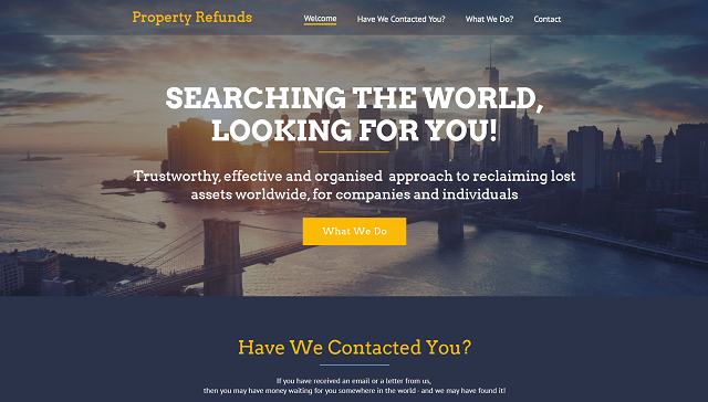
Look at this example:
(Source)
You can quickly tell what the page is about and what the next step is that you’re expected to take.
The most important thing to remember is that users want a few key things from navigation: knowledge of where they are on the site, the next step they need to take to complete an action (whether it’s to buy a product, sign up for a newsletter or get in touch with you) and a way to go back (or home). The easier it is for people to do these things, the quicker they’ll complete their desired action and the more likely they are to come back.
2. Colour scheme
The colour scheme of a web page needs to align with your business’s colour palette and that of your entire website. If you’re not a professional web designer, it may be easy to fall into the trap of using too many colours on a site, colours that don’t complement each other or different colours for each web page on your site.
This example is a no-no as it uses so many colours that it makes the page look and feel chaotic. It’s difficult to tell where you should look first or what you’re expected to do next:
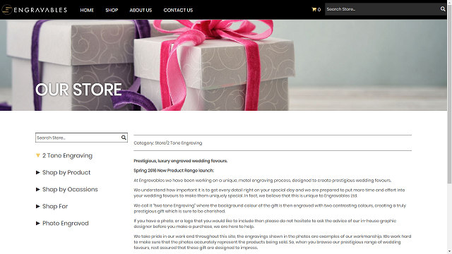
So pick a simple colour palette for your entire website and try to stick to it for every page on your site. Here’s a good example:
(Source.)
As you can see, often a minimal colour palette is all you need.
Now, if you’re not familiar with colour schemes and how to quickly and easily develop one for your site, use a tool to make the task easier. Paletton, Adobe Colour CC and COLOURlovers are just a few tools you can use for this purpose.
3. Stand-out images
People love to see things in action. So make sure you have some stunning visuals on your web page to draw users in and to show off your products, your team, and whatever else you think might engage your visitors.
Take this example:
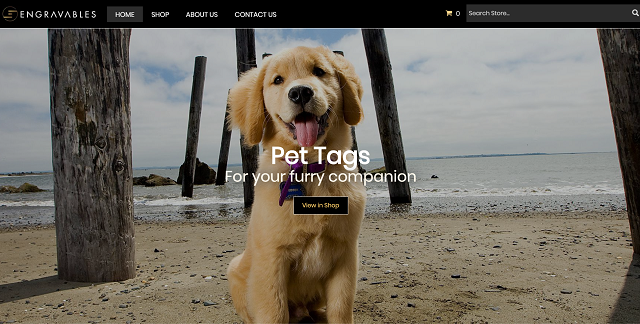
If you’re on a budget, you can always take photos using your smartphone. If that doesn’t appeal to you, there are loads of places where you can find stock images, no matter your budget.
When you use them on your web page, make sure to also optimise them for search engines. Why? Because it can help users discover your images in search and it can also lead to higher rankings for your site. Check out our guide on how to optimise images for search engines.
4. Strong call-to-action
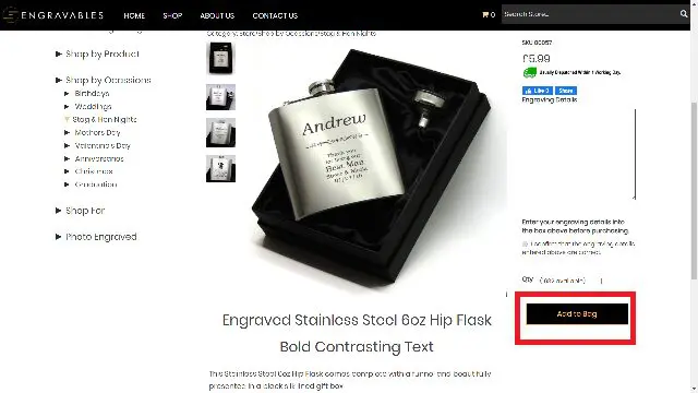
Every web page should be a gateway to an action – whether to provide information, to make a sale, to sign up for a newsletter. If you want visitors to know what they’re expected to do next, make your call-to-action obvious and highly visible on the page.
Also consider making the button a bigger size so it’s impossible to miss, as well as using a contrasting colour. When it comes to the text on the button, it should say exactly what you want the user to do: Buy, Join, Download, Sign Up, etc.
Here’s an example:
5. Your business information
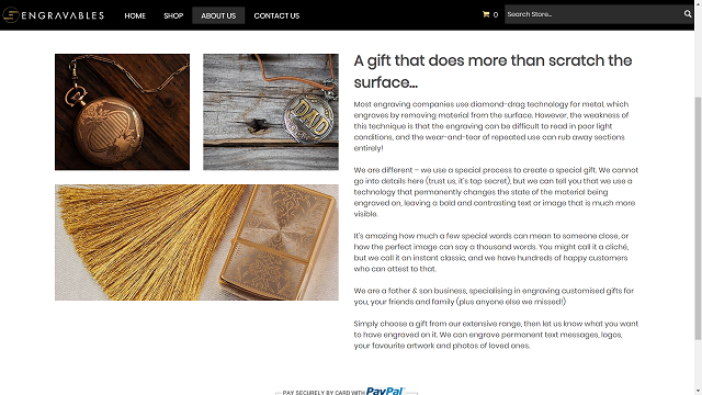
Don’t forget to include important information about your business like what you’re about, what you’re selling, whether you only sell online or if you also have a physical store, what time you open and close. This information is critical to building trust amongst potential customers so not including it isn’t an option.
Check out this example:
6. Contact information
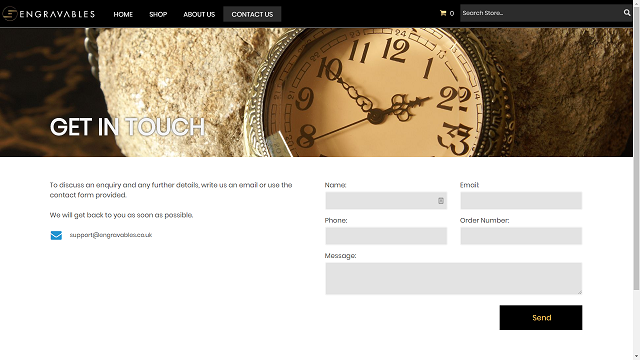
Your contact information needs to be clearly visible so users don’t have to go looking for it (because they won’t). Make sure to include your phone number, address and an email address that’s professional and trustworthy.
Add a separate contact page (like the example below), and include either your full contact details in your page footer, or a link to your contact page.
7. Social media presence
As you can see in the examples above, the first business has also included links to their social media channels in the footer. This not only provides users with information about where they can interact on social with that business, but it also makes the business more credible.
So, if you want to grow your business online, creating and maintaining a social media presence is a must. Using platforms like Twitter, Facebook, Instagram and Pinterest can help you to engage with your customers, drive traffic to your site and also share content that your fanbase might find useful and interesting.
If you’re not sure where to begin, we have a few guides to help you get started:
Your 8-step guide to getting started with social media
Choosing the right social media platforms for your business
8. Mobile-friendliness
The web is mobile. We all use our mobile devices to do research, to read reviews and to buy products online. Plus, with search engine giant Google giving more priority to mobile friendly websites in mobile search results, you know you need to focus on providing your visitors with the best possible mobile experience.
Read our post to learn what mobile friendly really means and how you can get a mobile friendly site.
If you go for 123 Reg’s Website Builder, you’ll get a responsive website as standard.
9. Web hosting that’s right for your business
If you want every page on your site to load fast (and you do, otherwise your visitors will leave after two seconds), you need to make sure you are on a server that is suitable for the amount of content and traffic you are receiving. A good web hosting company should offer several pricing plans so that you can pick the one that suits you best, and come bundled with handy tools and support.
If you go with 123 Reg’s Website Builder, hosting is part of the deal.
Otherwise, the hosting package you choose has a huge impact on the speed of your site, among other important performance-related things so make sure you choose that one that best suits your needs. Take some time to carefully research your options and choose a UK web hosting company that is reliable, available and always willing to help.
If you’re looking to move your site from a free host to your own domain, check out our guide that walks you through the steps to follow so you can make the move easily.
10. Optimisation
A good page doesn’t just look nice, it also works properly. Broken links, for example, can damage the reputation of your site and drive visitors away. So will a web page that barely describes your business or a product in 50 words or less. And so will a page that requires the user to take ten steps to buy a product.
Make sure you optimise every page on your site correctly by following these vital steps in our SEO guide.
Wrapping up
While there are many important elements to effective web page design, including the ones above can really make a difference. These components, often overlooked, can make or break your web page design, which can translate in to poor sales.

