
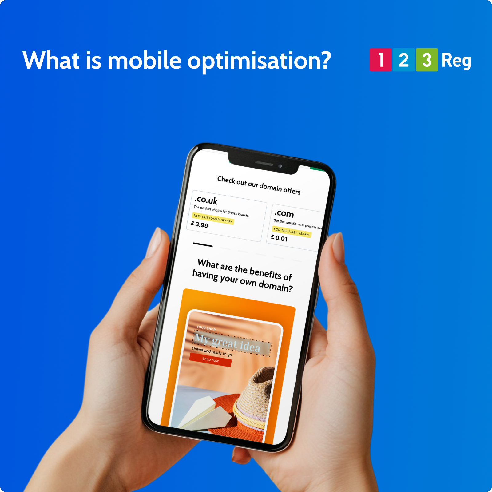
Mobile optimisation means designing your website to work just as well on smartphones as it does on desktops.
Rather than creating separate versions of a site, most modern websites use responsive design. This allows layouts, images, and menus to adjust automatically to different screen sizes, so visitors get a consistent experience wherever they are.
With the majority of customers now browsing, shopping, and searching on their phones, any good business website site needs to be fast and easy to engage with on smaller screens.
Why Mobile Optimisation Matters
Mobile is no longer a secondary way to browse, it’s often the default. Most users will land on your site from a phone first, and that first experience tends to shape what they do next.
If a site feels slow, awkward to navigate, or hard to read on a small screen, people don’t tend to stick around. They move on quickly. That has a direct impact on enquiries, sales, and general engagement.
Search engines also factor mobile performance into rankings, so it influences how visible your site is in the first place.
For businesses, the key point is simple. Your site needs to work properly where most people are actually viewing it. That means clear content, easy navigation, and actions like calling, buying, or contacting you being straightforward on a phone.
What makes a site mobile-friendly?
A well-optimised mobile site focuses on usability and speed:
☐ Clear, readable text that works on small screens.
☐ Simple layouts with easy navigation and minimal clutter.
☐ Fast loading times through optimised images and lightweight pages.
☐ Touch-friendly design, including large buttons and tap targets.
☐ Key information (like contact details or offers) placed front and centre.
Mobile-Friendly vs Responsive Design
A mobile-friendly website is one that functions well on smaller screens. Content is readable, spacing is adjusted, and navigation is usable without needing to zoom or constantly adjust the view.
Responsive design builds on that by adapting the layout itself. Rather than shrinking a desktop version, the site reflows depending on screen size, so it feels intentionally designed for each device rather than simply compressed.
This approach has become the standard because it keeps one website that works across phones, tablets, and desktops without needing separate versions.
See also: Why You Need a Mobile-Friendly Website (and How to Get One)
How to be ready for mobile
Getting started is simple with Website Builder. Choose from a range of professionally designed, mobile-ready templates and you’re already set up to look the part on smartphone or desktop.
From there, just add your content and customise your pages. Everything adjusts automatically to different screen sizes, and you can preview how your site looks on mobile before you hit publish.
Learn how you can build a website in minutes with Website Builder


